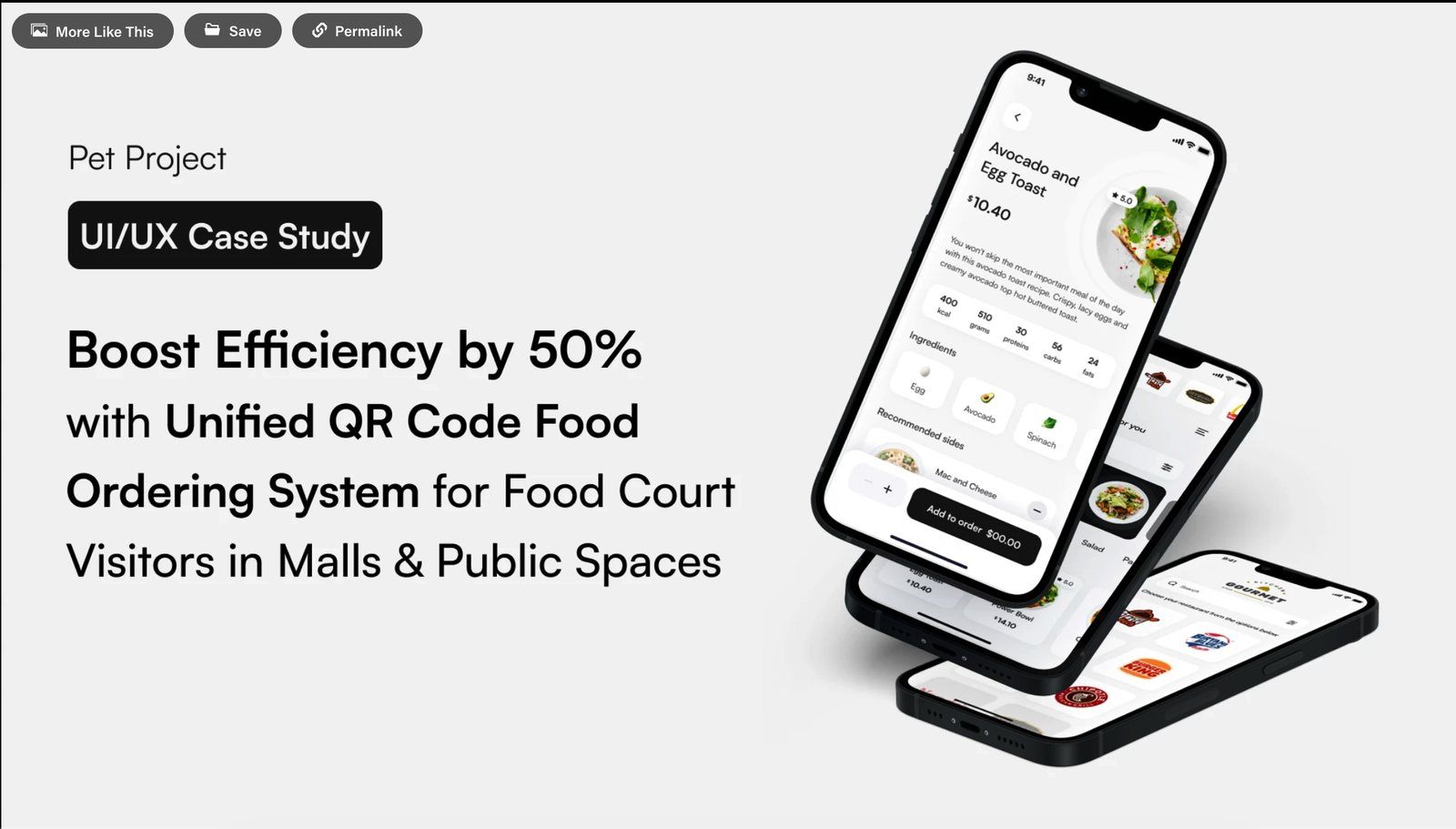
Food courts are shared spaces served by single-outlet apps.
Walk into a mall food court and you'll usually eat across two or three outlets — a biryani here, a coffee there, dessert from a third. But the QR-ordering apps stuck to each table are built for one restaurant at a time. To feed a table of four, you scan a code, order, and pay at outlet one, then repeat the whole flow at outlet two, and again at outlet three.
The result is exactly what these apps were meant to remove: fragmented ordering, repeated payments, and food that arrives at wildly different times. Many people give up and walk to the counters instead — which defeats the purpose of the QR system entirely.
- ✕One outlet per session — a multi-outlet meal means multiple scans, carts, and checkouts.
- ✕Separate payments fragment the bill and multiply friction at the moment people most want speed.
- ✕No shared timing, so dishes from different outlets arrive minutes apart.
- ✕Enough friction that visitors abandon the app for the very queues it was meant to replace.
A structured competitive teardown — and honesty about its limits.
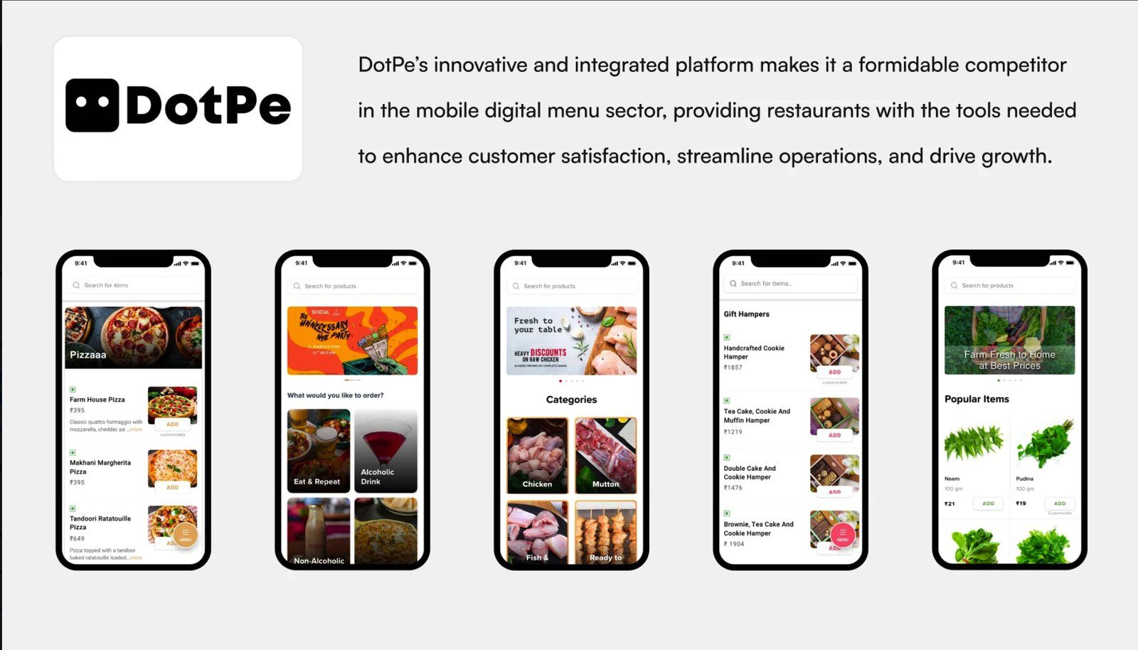
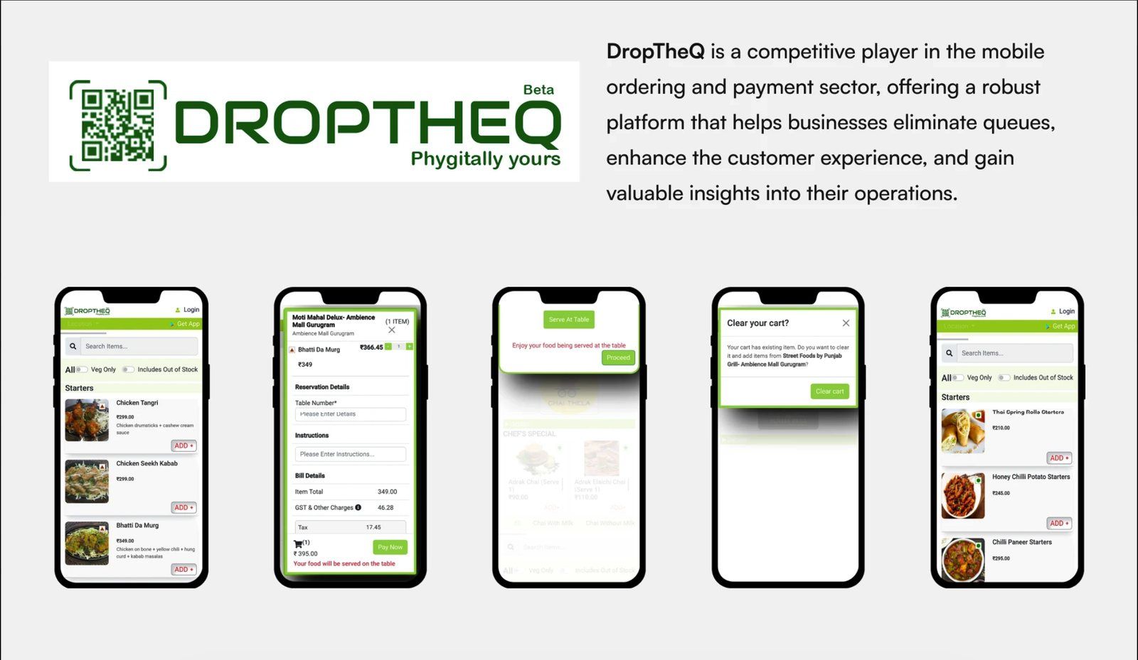
Because this was a self-initiated project without access to a live user base, I grounded it in a structured audit of the products already solving adjacent problems, rather than claiming primary user research I didn't run. The goal was to map what existing QR-ordering platforms do well, and pinpoint the one gap none of them close: multi-outlet ordering in a single cart.
Competitive audit
DotPe
DropTheQ
Working assumptions — hypotheses, not findings.
Without primary research, I won't present personas as validated fact. Instead these are the working assumptions I designed against — explicit bets about who feels this problem most, each one a thing I'd want to confirm or kill with real users.
The group orderer
Goal: feed a table from different outlets without running three separate transactions.
Assumed pain: juggling multiple apps/scans and paying several times.
The time-boxed visitor
Goal: eat quickly on a mall/lunch break and leave.
Assumed pain: staggered arrivals and queueing kill the time saving the app promised.
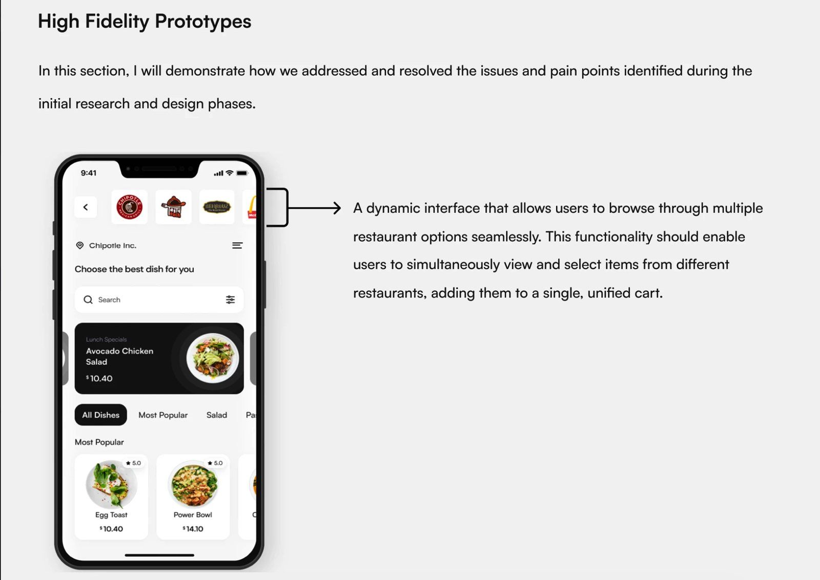
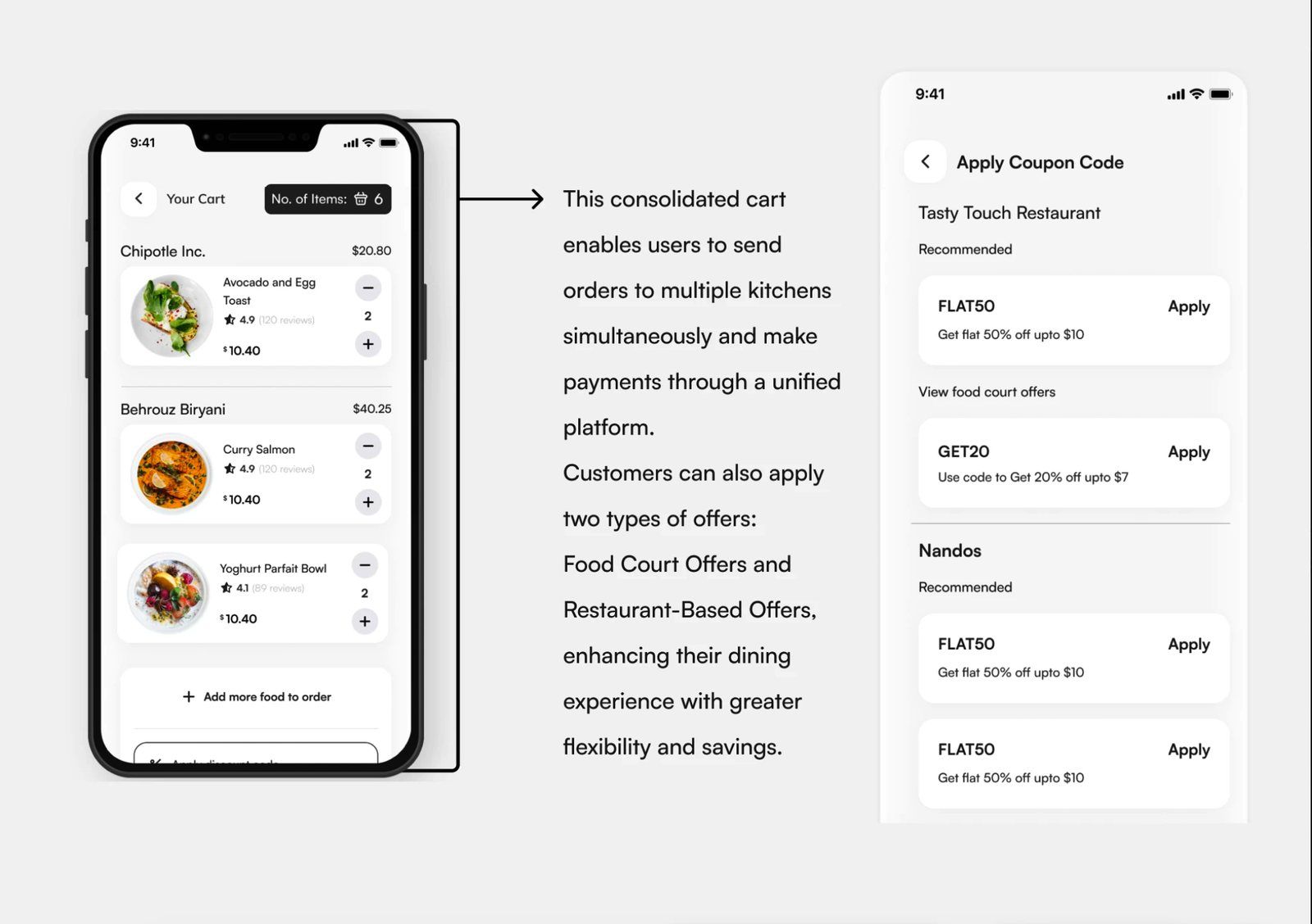
Treat the whole food court as one store with many kitchens: a single cart that groups items by outlet, sends each order to the right kitchen, and settles everything in one checkout.
Why this should reduce effort (the reasoning behind the old "50%")
My original Behance title promised a "50% efficiency boost." I'm retiring that number here, because I never measured it — presenting an unbacked stat as fact would be dishonest. What I can show is the structural reason the design should cut effort: it collapses N separate order-and-pay loops into one.
Today — 3 outlets
- Scan A → browse → cart → pay
- Scan B → browse → cart → pay
- Scan C → browse → cart → pay
- Track 3 orders, 3 arrival times
Unified cart
- Enter food court → browse all outlets
- Add from A, B, C to one cart
- One checkout, one payment
- Kitchens receive items in parallel
Mapping the happy path — and the failure branches.
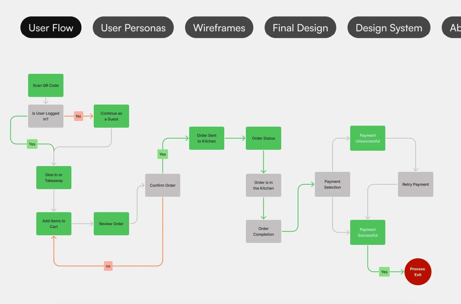
Before any UI, I mapped the full journey: scan or enter, choose guest or login, dine-in or takeaway, build a multi-outlet cart, and check out — including the branches most concepts skip, like payment failure and retry. Designing the unhappy paths up front is what keeps a "clever cart" from falling apart at the money step.
From insight to interface
The system, resolved.
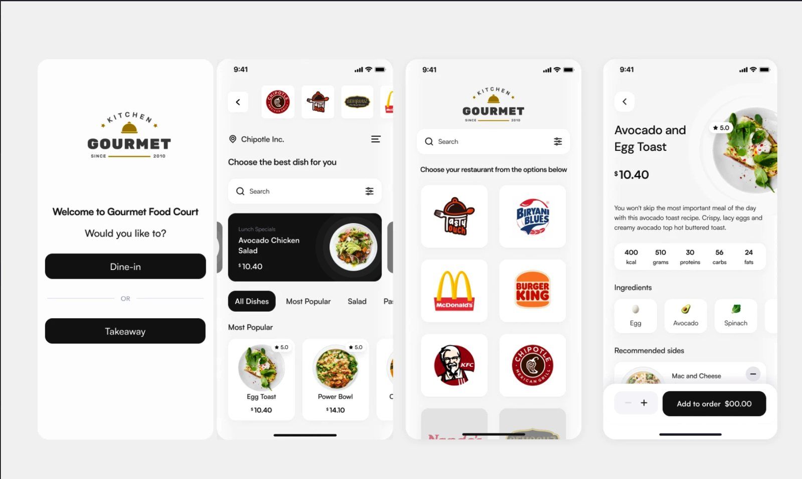
The final screens carry one visual system across entry, outlet selection, dish detail, and the unified cart — consistent components, type, and spacing so the multi-outlet complexity never reaches the user. A clean, confident UI was the part of this project I could take furthest on my own.
Early signal — directional, not proof.
I shared the prototype informally with a handful of people and watched them move through it. This isn't a usability study and I won't dress it up as one — it's early directional feedback. The recurring reactions were consistent enough to be worth recording.
"Oh — so I can just add the biryani and the coffee to the same cart? That's the thing I always want and never get."
"Paying once for everything is the part that would actually make me use it."
If this were a real brief, here's how I'd de-risk it
- →Timed task study. Order the same multi-outlet meal single-app vs. unified; count steps and time. That produces an honest efficiency number to replace the retired "50%."
- →Field observation in an actual food court. Watch how groups really split ordering and paying — confirm or kill the two persona assumptions.
- →Usability test of the unhappy paths. Payment failure, partial-kitchen availability, one outlet slower than the rest.
- →Operational feasibility with vendors. The design assumes kitchens accept parallel orders and a shared settlement — I'd pressure-test that with operators before building.
What I'd keep
The core bet — food court as one store with many kitchens — is the part I'm most confident in, and the part every competitor leaves open. That white space is why the concept is worth validating properly.