Team contribution, stated honestly.
UX4G Design System 3.0 is real, official, and public — built by the National e-Governance Division and Digital India Corporation under the Ministry of Electronics and IT, published openly on Figma Community, and used to build accessible digital services across Indian government ministries and state portals.
My employer was contracted to work on it. I contributed as part of a larger team over roughly 6–12 months — components, interaction patterns, design tokens and documentation. This is not a system I own or built alone, and there's no individual public credit for my specific contributions on a project this size, with this many contributors. I won't inflate that. What I can do is show you, with screenshots from my own work, exactly what I designed and why.
Not a growth metric. A certificate someone needs.
UX4G's own design guidance is explicit about who it's built for: users with lower digital literacy, people accessing services through VLE kiosks rather than their own device, connections that drop to 2G, and content that has to work across 22 scheduled languages. That's not a hypothetical persona — it's the baseline constraint on every component in the system.
It changes what "edge case" means. In a consumer product, a rejected form or a locked-out login is an annoyance. Here, it might be someone's income certificate application, needed for a scholarship or a loan, on a connection that keeps dropping, filled in a language the design team may not read fluently. The unhappy path isn't rare here — it's a large share of real usage.
Design the good state. Then design the bad one.
Across every component I worked on, the same discipline shows up: don't stop at the default and success states. An OTP field that only handles correct entry isn't finished. A modal that only shows a neutral confirmation isn't finished. A card with no disabled treatment isn't finished. The components below all carry this through — and in a couple of cases, the "bad state" logic was a security or policy requirement handed to me, which I'll say plainly rather than take credit for deciding.
A component isn't done at "it works." It's done when locked out, rejected, and disabled have all been designed as carefully as default and success.
Six states, and the lockout was the point.
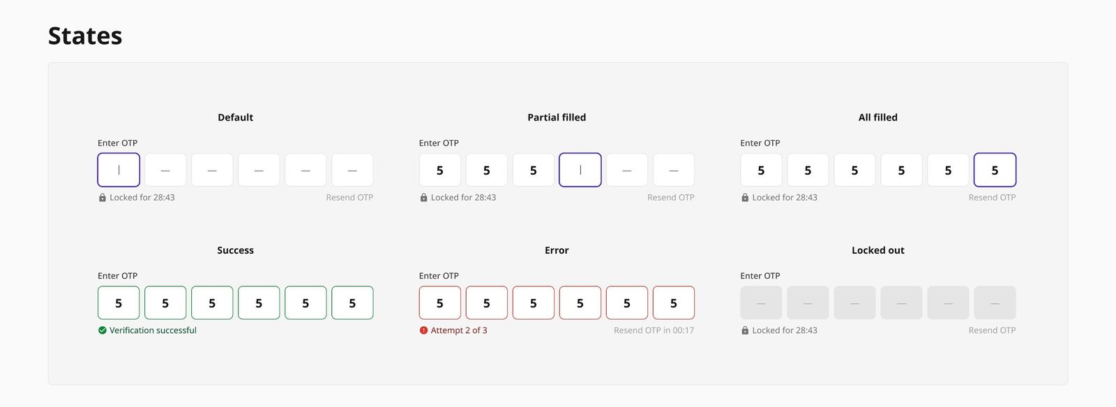
OTP verification is one of the most common friction points in Indian government services — Aadhaar-linked flows, certificate applications, benefit disbursals. I designed the component to move through six distinct states: Default, Partial filled, All filled, Success, Error, and Locked out — each communicated through colour, iconography and copy, not just the numbers in the boxes.
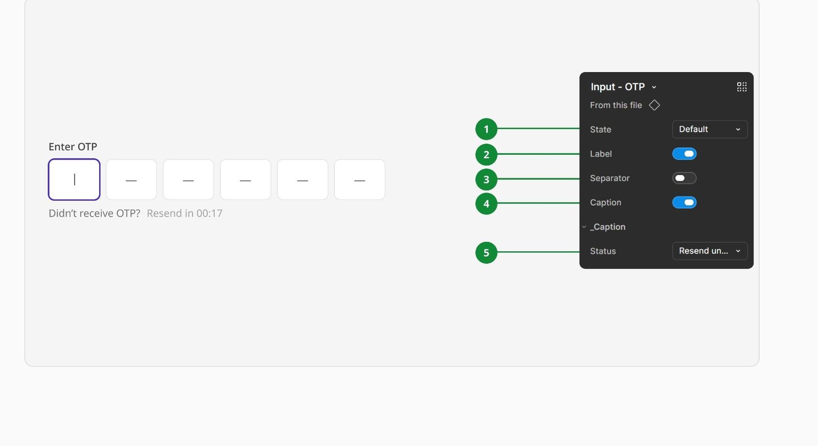
The component also exposes its state, label, separator and caption as independent toggles, so teams building different flows — say, a shorter 4-digit OTP versus a 6-digit one, or a flow that doesn't need a resend link — can configure it without a variant explosion.
Same discipline, three more components.
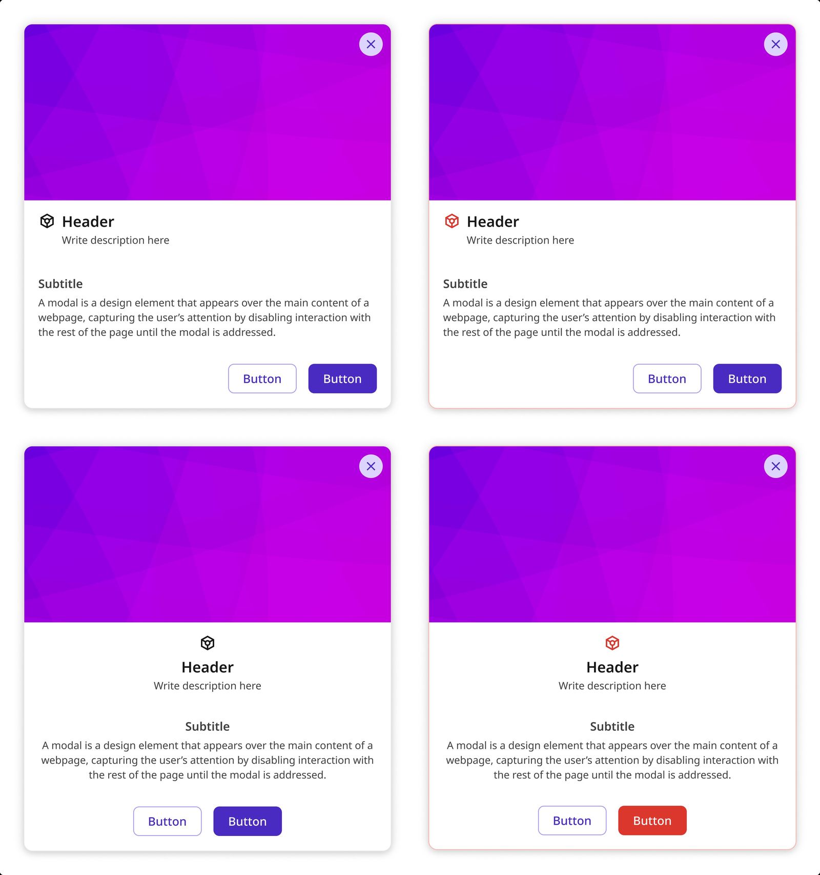
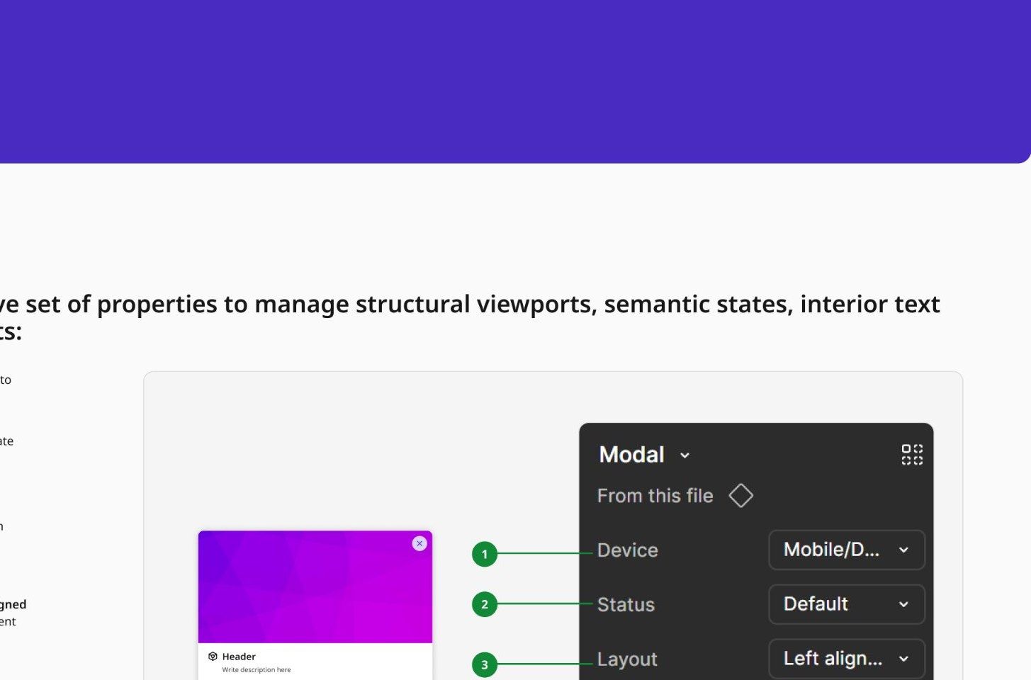
The Modal separates Layout (Left aligned or Centered) from Status (Default or Error) as two independent properties rather than baking them into fixed "modal types" — so any combination is buildable from one base component, and the header, body and footer sections can each be switched on or off depending on what a given confirmation actually needs to say.
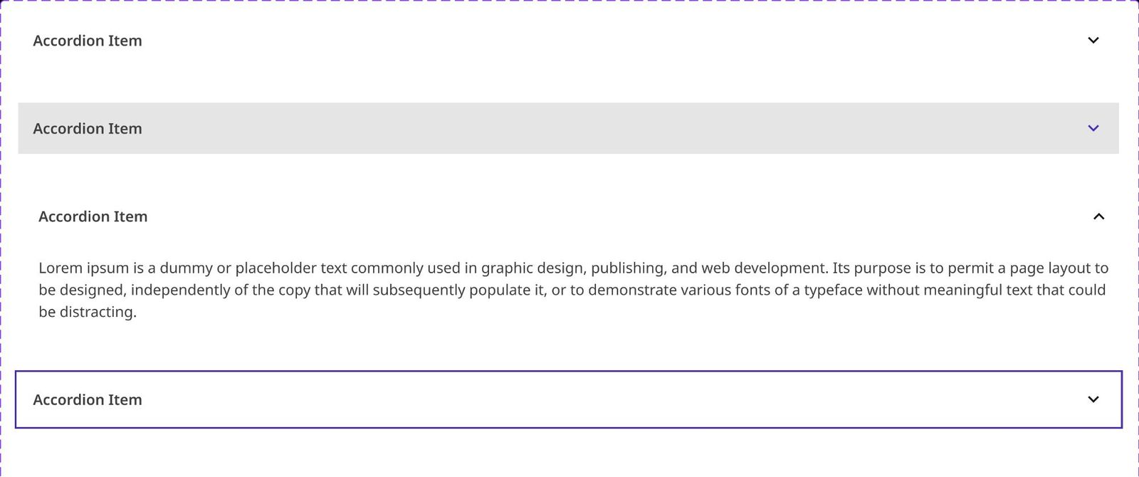
Accordion — including the states that get skipped
Default, hover, expanded, keyboard-focused, and disabled — the Accordion documents all five. Focus and disabled states are the ones most component libraries quietly skip until an accessibility audit flags them; specifying them up front means implementing teams don't have to guess or invent their own treatment mid-project.
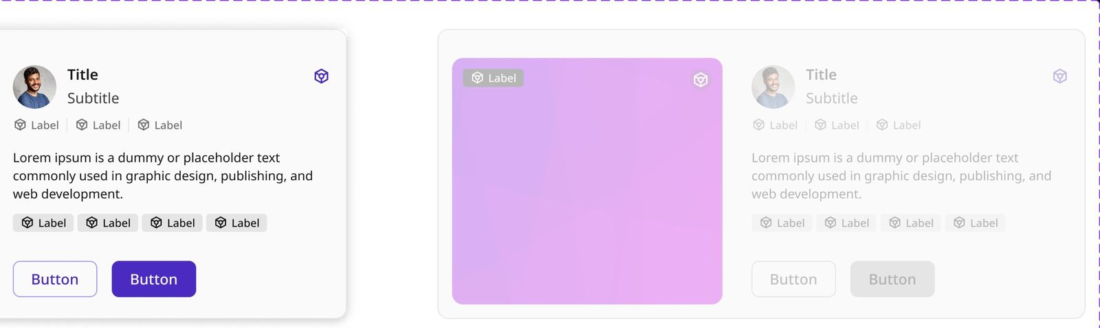
Card — disabled means everything, not just the image
The Card composes an image with a status badge, an avatar and title block, an icon-label metadata row, body copy, a second tag row, and a two-button footer — one component covering a scheme listing, a document record, or a service tile. The disabled state converts every one of those pieces consistently: the image desaturates, every label and icon drops to grey, and both buttons — not just the primary — switch to a disabled treatment.
One flow, and a third honest outcome.
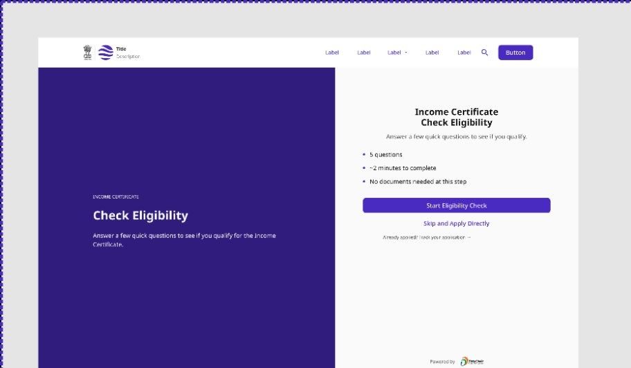
The most complete piece I worked on is an eligibility-check pattern — a multi-step wizard for an income-certificate application. It opens by setting expectations before asking anything: five questions, about two minutes, no documents needed yet — with an explicit way out for people who don't want to go through it ("Skip and Apply Directly") and a path for people who've already applied ("Track your application").
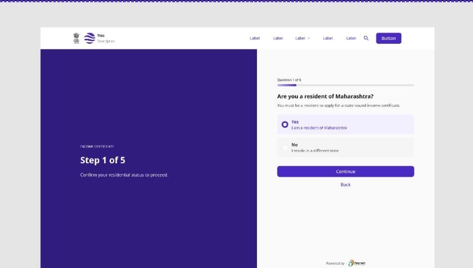
Three outcomes, not two
The easy version of this pattern forces a binary result: eligible or not. I designed a third state instead, because the underlying reality has one — some criteria genuinely can't be verified automatically and need a human to check them. Forcing that case into a false "yes" or "no" would either mislead someone or block them for no real reason.
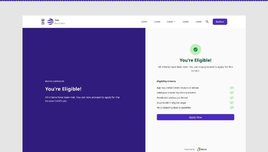
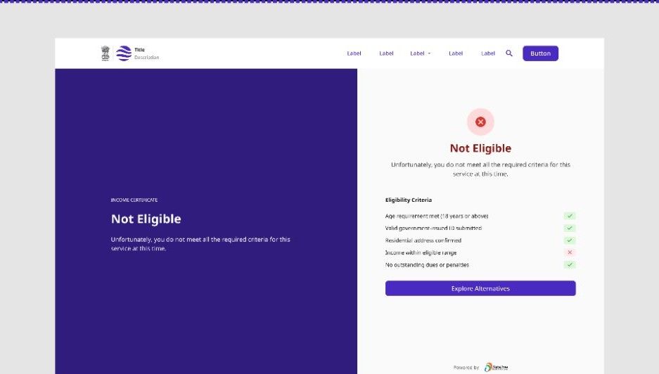
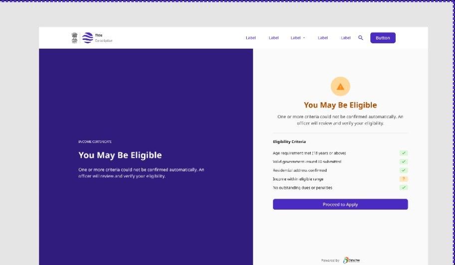
The same pattern, reskinned per department
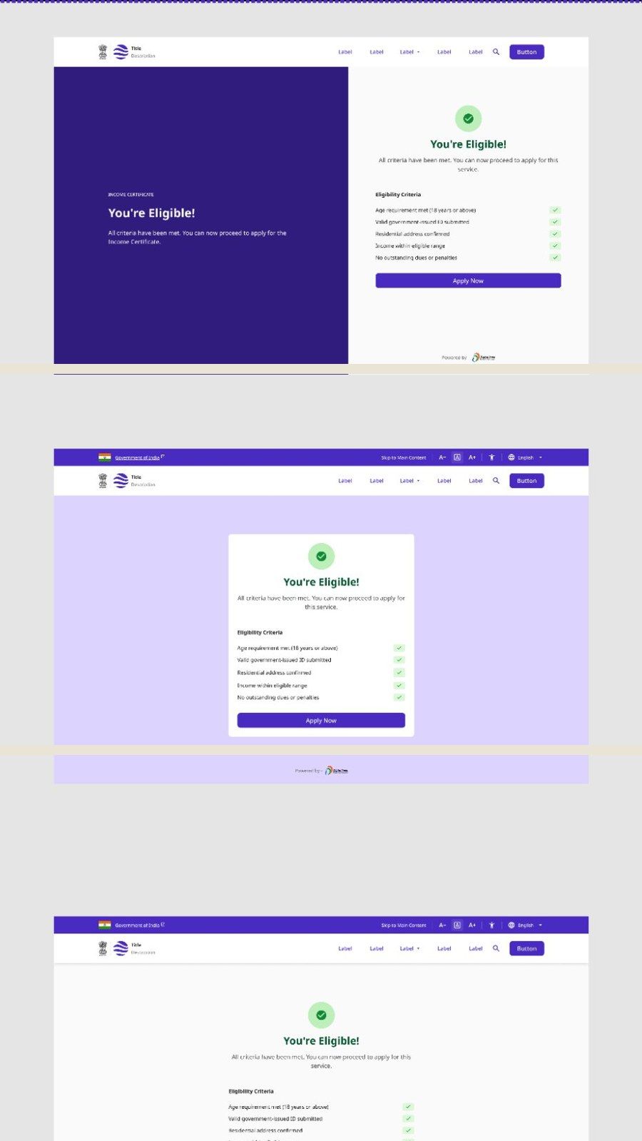
UX4G ships a Theme Craft plugin so different departments can apply their own primary colour and typography without touching the underlying components. The screens below are the same "You're Eligible" outcome in three different themes — including one with the full accessibility toolbar visible (font-size controls, a skip link, and a language selector) that UX4G's guidelines call for on every page.
Honest about the credit, confident about the work.
UX4G is live, official, and in active use — that's independently verifiable at ux4g.gov.in. What isn't independently verifiable is which specific pixels are mine on a contributor list this size, and I'm not going to pretend otherwise. What I can stand behind is what's in this case study: real exports from my own design files, for components I can name and explain, with the parts that were policy rather than my decision marked as exactly that.
What I'd want, with more control over it
- →Individual attribution in the Figma file. Not something I can add unilaterally to a system this size, but worth naming as a gap rather than pretending it doesn't exist.
- →Usage data across the departments that adopted these components. I know the pattern shipped; I don't have visibility into how it performed once departments picked it up.
- →A documented decision log. The attribution notes in this case study exist because I remember the conversations. A system this size would benefit from that being written down at the time, not reconstructed afterward.
What I'd keep
The discipline of designing the bad state as carefully as the good one. It's the one thing that shows up identically across an OTP field, a modal, an accordion, a card, and a five-step government form — and it's the part of this work I'd defend regardless of who gets credited for it.