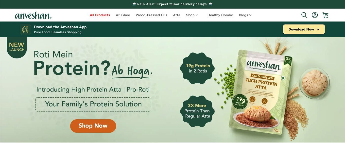
Build the storefront and the app. From scratch.
Anveshan is a D2C food brand sourcing from farmer networks across Gujarat, Karnataka and Tamil Nadu. They engaged me as a freelance designer — the only designer on the project, working alongside their in-house engineering team — to build their commerce experience end to end.
Two business problems drove the brief, and they turned out to be the same problem wearing different clothes:
The brand didn't convey purity
In ghee and cooking oil, "pure" is what every seller claims and no buyer can verify. Saying it louder doesn't work.
There was no retention channel
Groceries are a repeat-purchase category, but the business had no app — no way to bring a customer back cheaply.
The real fear isn't quality. It's adulteration.
Indian shoppers buying ghee online aren't mainly worried that the product will be mediocre. They're worried it's not what it says it is — vanaspati (Dalda) sold as desi ghee, palm oil cut into cold-pressed oil, synthetic colour, hormone residue. It's a category with a long public history of adulteration scandals.
That reframes the design problem completely. A prettier product page doesn't fix a credibility gap. The job wasn't to assert purity harder — it was to make purity checkable, so a sceptical buyer could satisfy themselves without taking our word for it.
Every purity claim on the site has to be attached to something the customer can inspect — a document, a place, a process, or a face.
Turning a claim into a chain of proof.
Rather than one "trust badge" strip, I built the product page as a sequence that answers doubt in the order it arrives. Each rung is a different kind of evidence, because different buyers are convinced by different things — some want the lab report, some want to see the farm.
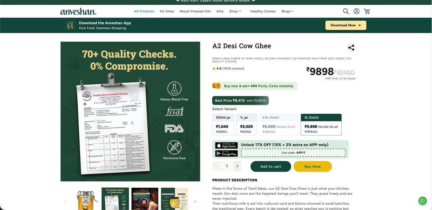
The document
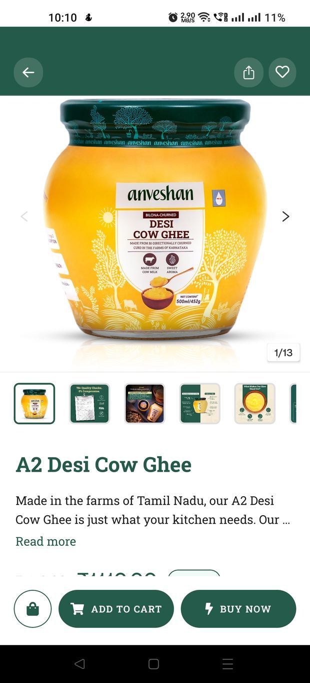
The PDP gallery opens on an actual third-party lab report — batch number, FSSAI test parameters, saponification values — beside Heavy Metal Free, FSSAI, FDA and Hormone-free marks. Not a badge that says "tested". The test.
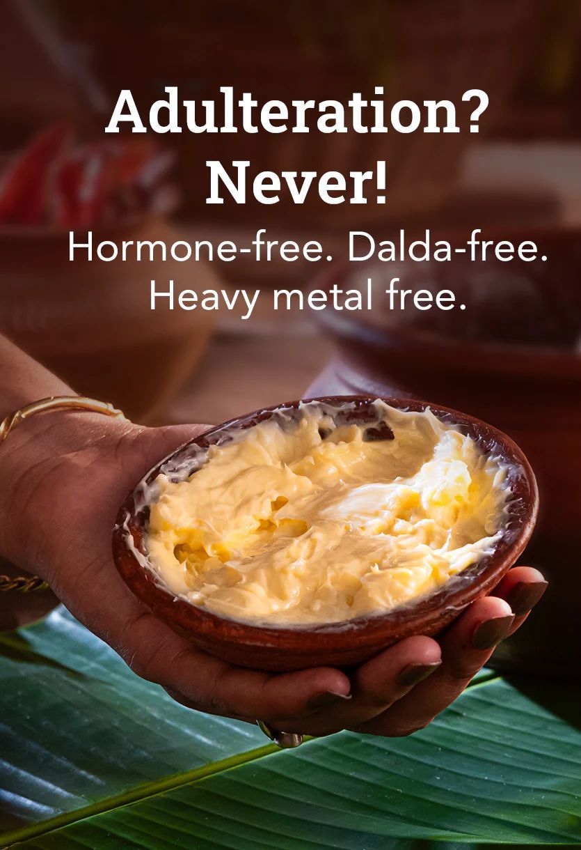
The named fear
A tile that says the quiet part out loud: Adulteration? Never! Hormone-free. Dalda-free. Heavy metal free. Naming Dalda specifically signals we know exactly what you're afraid of.
The process
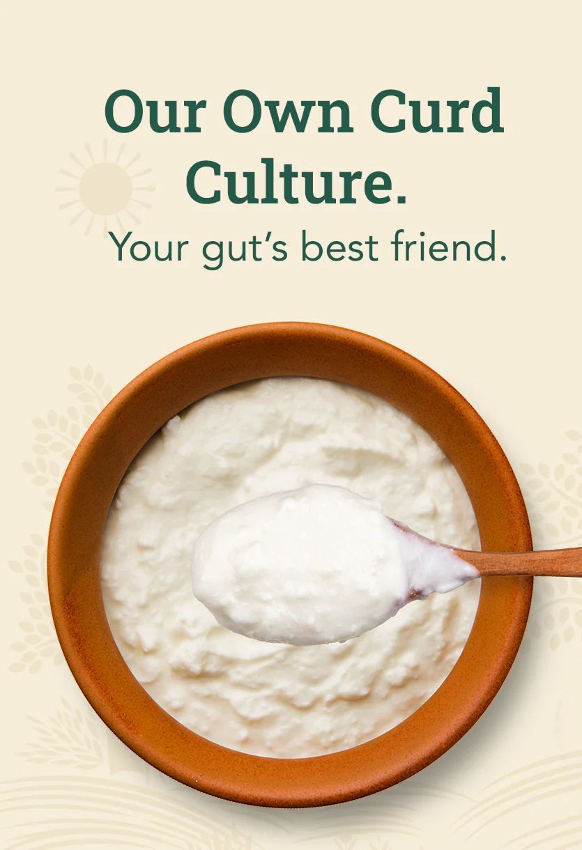
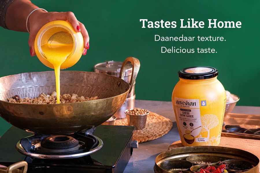
Bilona churning, our own curd culture, wood-pressing — shown as method, not adjective, so "traditional" becomes something concrete.
The origin
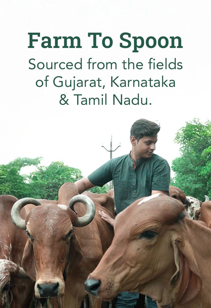
Farm To Spoon: named sourcing regions and the farmer network behind them, with people visible rather than stock imagery.
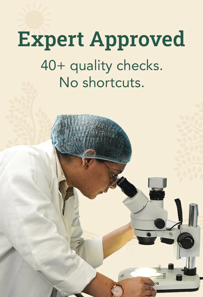
The scale of checking
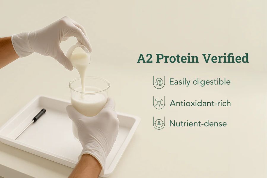
40+ quality checks per batch, in-house testing, and a lab technician actually at the microscope.
Making a ₹9,898 tin feel rational.
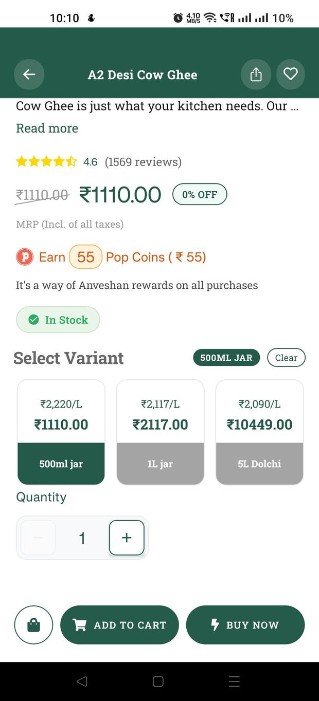
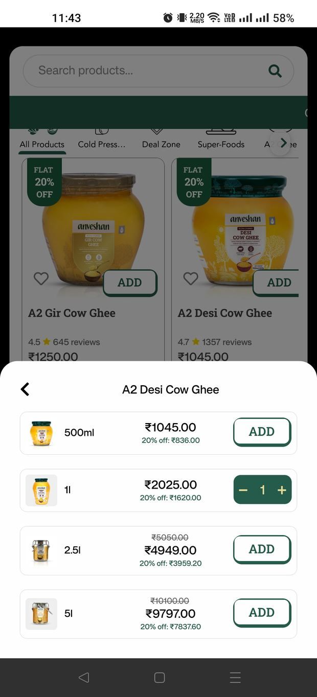
The catalogue is variant-heavy: one ghee exists as a 500ml jar, a 1L jar, a 2.5L dolchi and a 5L dolchi, across glass, plastic and tin. Bulk sizes carry the best value but the worst sticker shock — a buyer sees ₹9,898 and flinches, without registering that it's the cheapest way to buy.
Working with the business, we normalised every variant to a per-litre price shown directly under the pack price — ₹2,090/L against ₹1,979.6/L — so the value ladder is legible at a glance instead of requiring mental arithmetic. Cross-size comparison stops being work.
An app has to earn its place on the home screen.
A store that already works on mobile web has to justify why anyone would install anything. "We have an app" is not a reason. So the app was designed around the two things a website genuinely can't do as well: rewarding repeat purchase, and making reordering effortless.
Purity Coins, surfaced where it counts
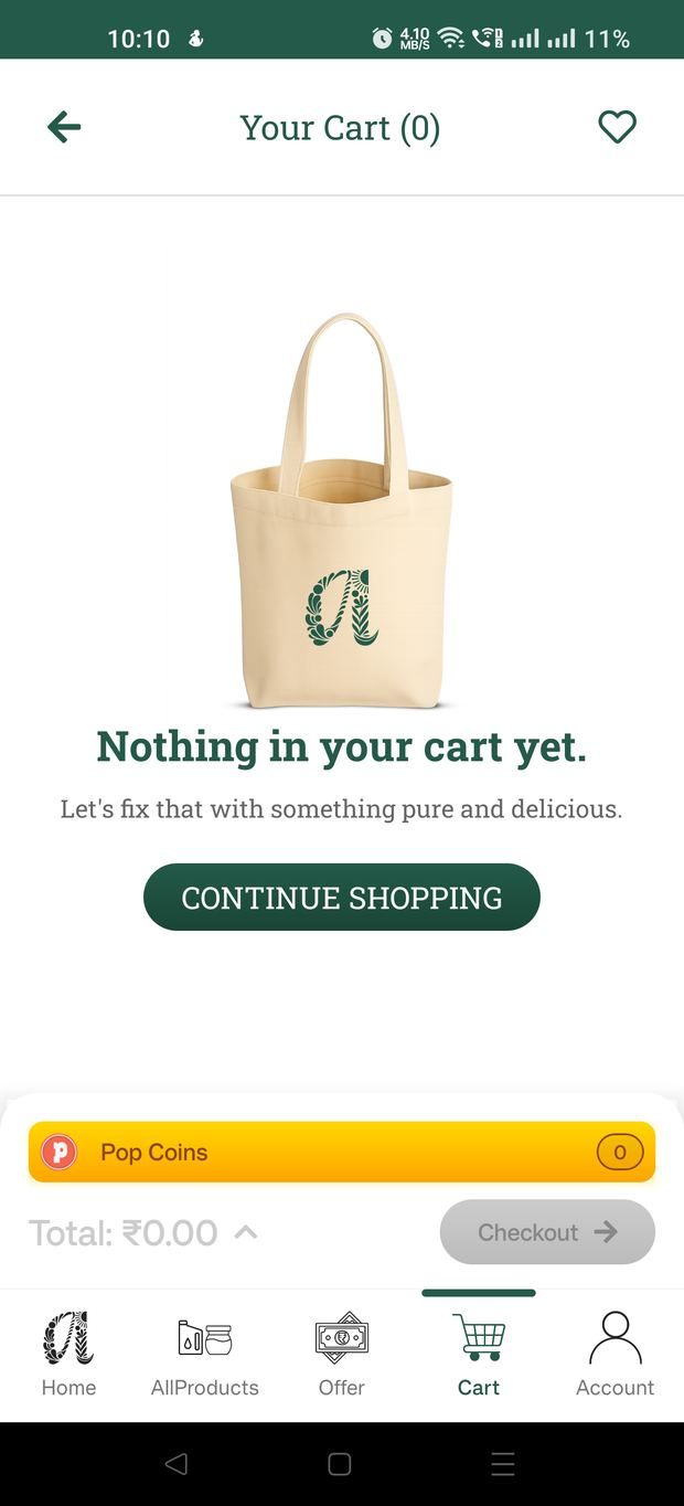
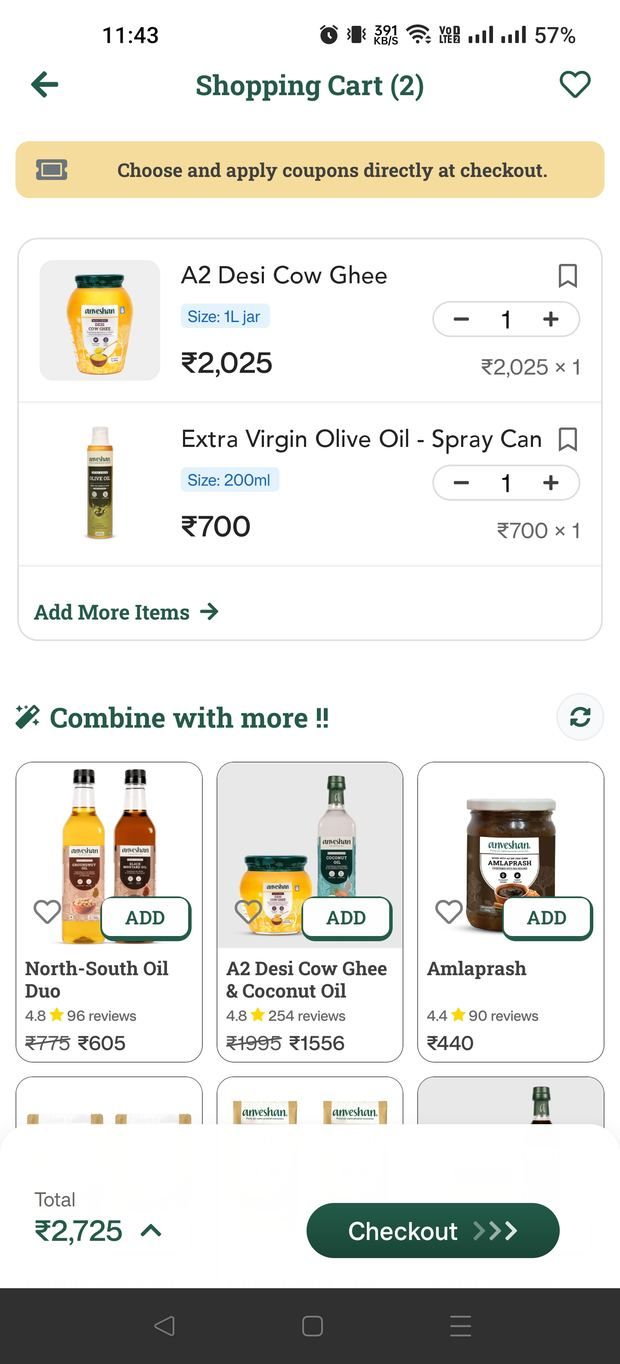
The loyalty currency isn't hidden in a profile tab. It appears at the three moments it can change behaviour: on the product page as an earn-rate before you buy ("earn 494 Purity Coins instantly"), in the cart as a balance you're building, and on the empty cart as a reason to start again. A reward you can't see doesn't retain anyone.
A deliberate path from web to app
The storefront actively recruits for the app: a persistent download banner, and on the product page an app-exclusive offer — an extra discount available only in-app. I designed how that offer is presented on the PDP; the business set the commercial terms. It converts a passive "we also have an app" into a concrete reason to switch channel.
Same brand, native behaviour.
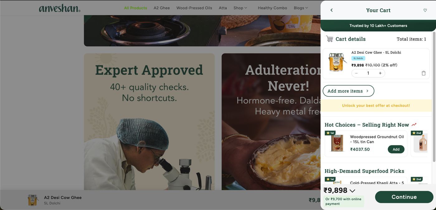
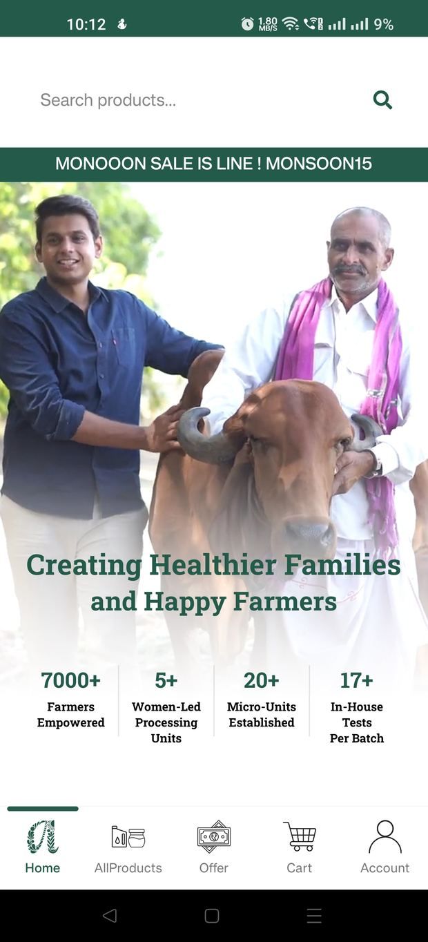
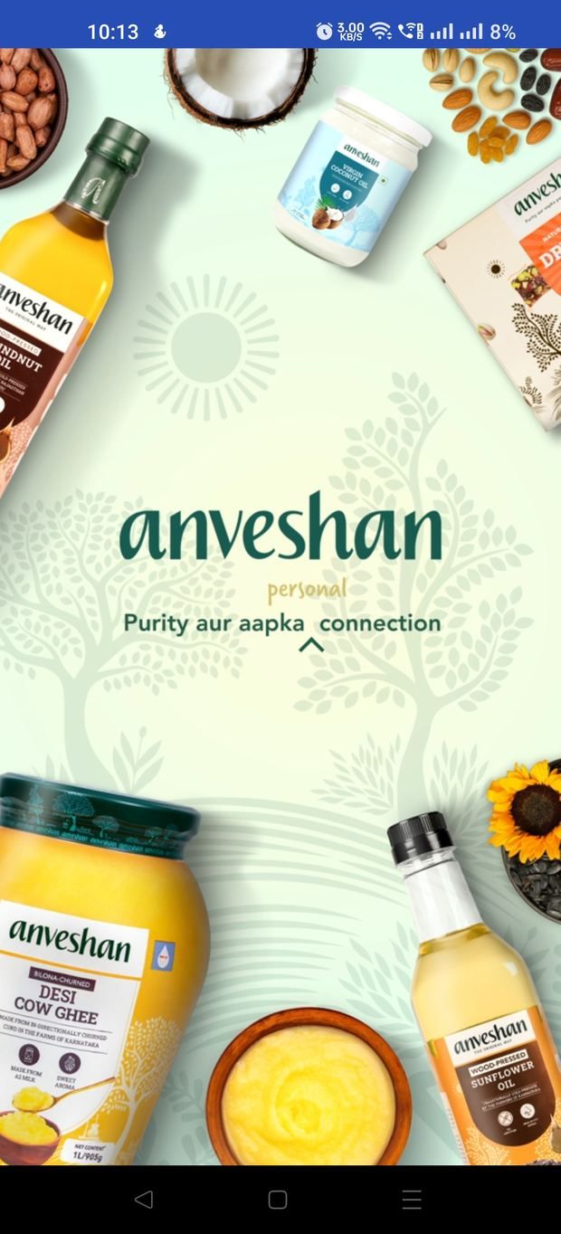
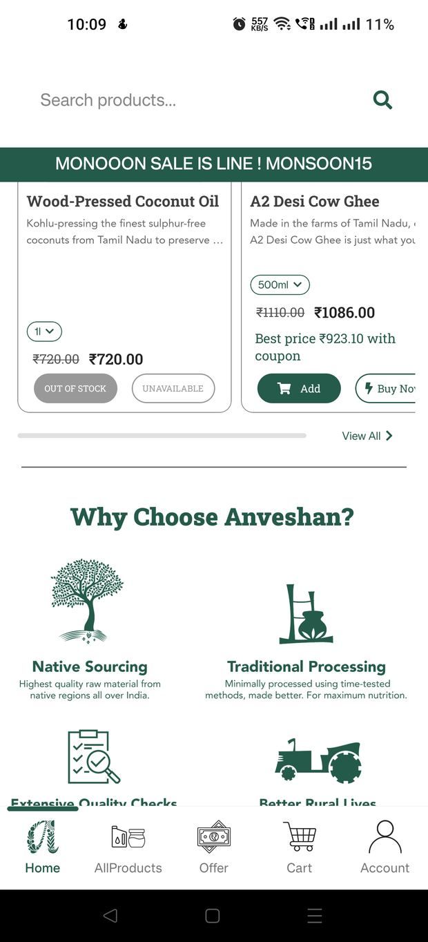
Web and app share one visual system — the deep forest green, the botanical mark, the same typographic hierarchy and product-card anatomy — so the brand reads as one thing. But the interaction patterns follow each platform's conventions rather than forcing a single layout through both.
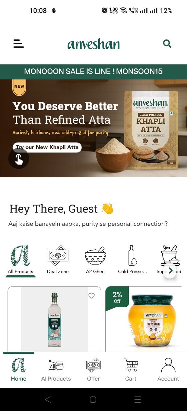
The app uses a five-tab bar, a drawer for account and content, bottom sheets for variant selection, and a floating "View Cart" pill that follows you down the page. The web uses a mega-nav, a slide-in cart drawer, and hover-driven product cards. Shared design tokens, different muscle memory.
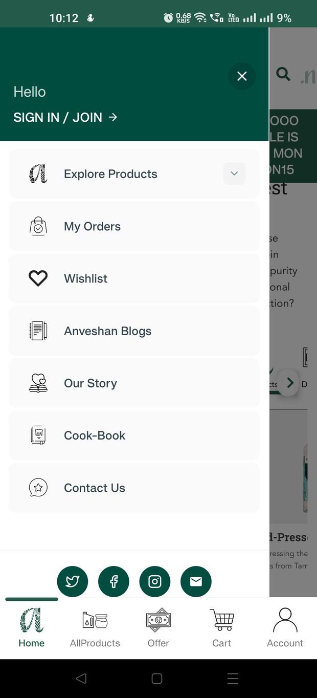
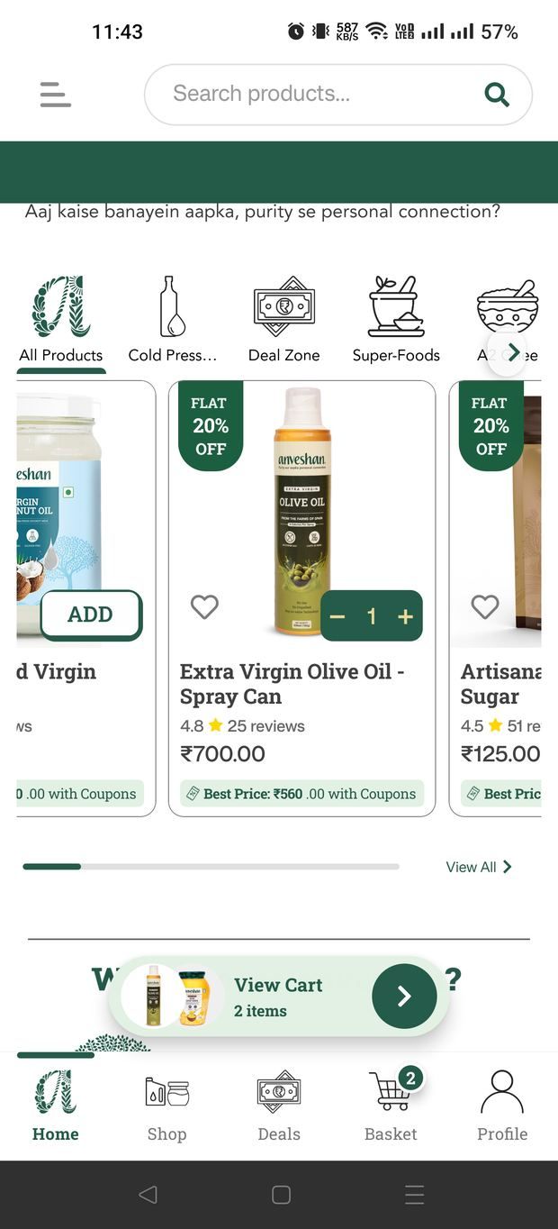
The brand voice travels too. The app greets you in Hinglish — "Aaj kaise banayein aapka, purity se personal connection?" — matching how the brand's customers actually speak, rather than defaulting to formal English.
Shipped, live, and still running.
Both the storefront and the app went live and remain in production, serving a catalogue that has since expanded well beyond what launched. The trust architecture, the variant and pricing patterns, and the app's loyalty surfaces are all still in use — and the business has continued building on the system rather than replacing it, which is the outcome I care most about as a freelance designer handing work over.
What I'd do differently
- →Test the evidence ladder, not just ship it. The order of proof — document, then fear, then process, then origin — is a hypothesis I reasoned into. It deserves a real test to find out which rung actually moves a hesitant buyer.
- →Design the merchandising guardrails. Campaign banners are edited by the marketing team, and live promo copy can drift from the system. A tighter template with character limits and a preview step would protect the polish.
- →Push further on post-purchase. Reorder is the strongest retention lever in groceries; with more time I'd have built subscription and one-tap reorder into the core loop rather than leaning on coins and offers.
- →Close the loop on the app incentive. An app-only discount buys installs, but the real question is whether those users repeat more. I'd want cohort data before calling that strategy a success.
What I'd keep
The core idea holds up: in a category built on suspicion, the most valuable thing design can do is hand the customer the evidence and let them decide. Leading a product page with a lab report instead of a lifestyle shot is a small act of respect for the buyer's scepticism — and it's the decision the rest of the work hangs from.