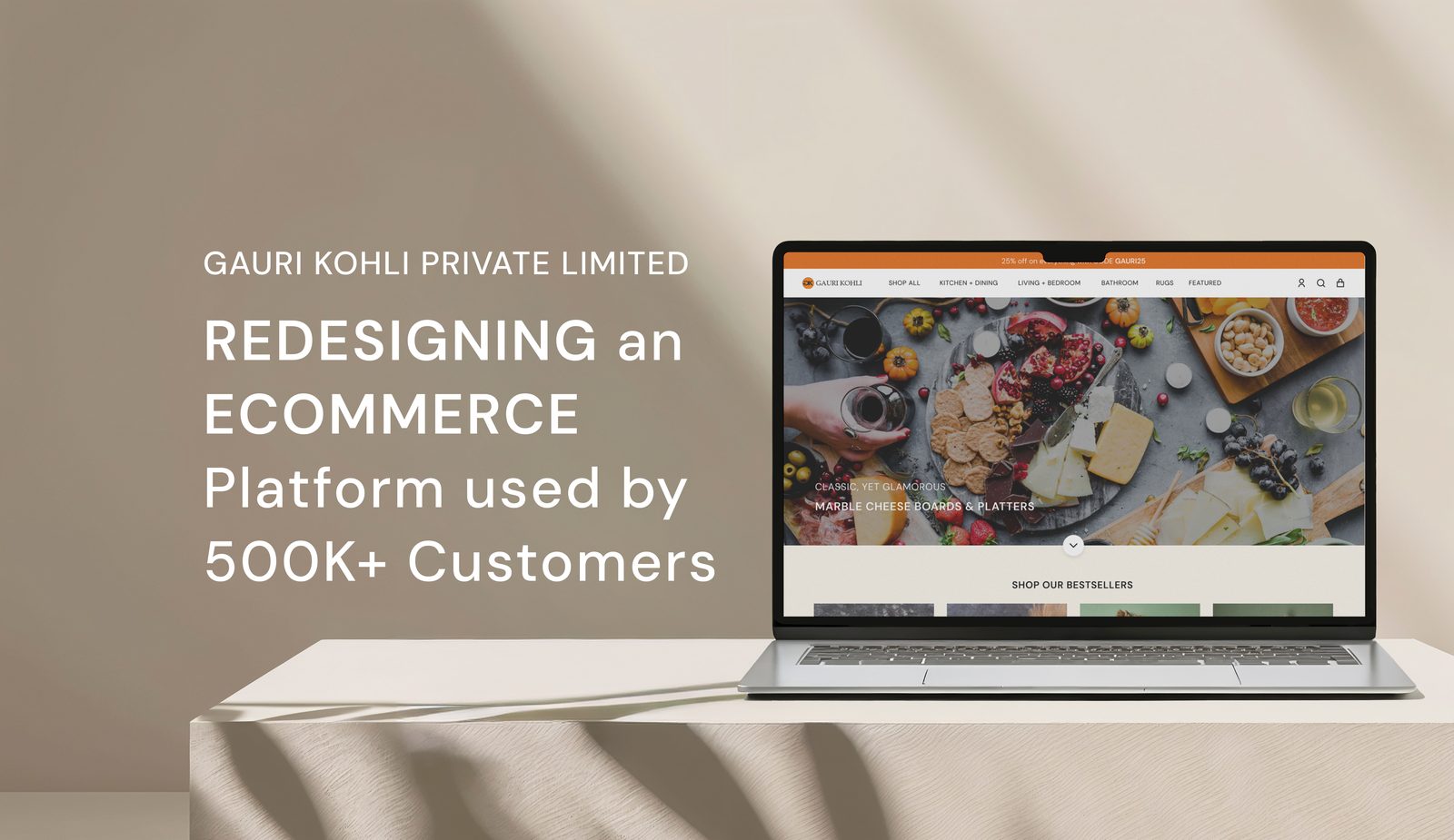
Redesign the platform an existing brand already runs on.
Gauri Kohli is a home-goods brand working in natural materials — marble and onyx serveware, brass and rattan tools, handwoven rugs and textiles — sold direct to a US audience through a Shopify store. Unlike a from-scratch build, this was a live, trading platform: the redesign had to hold up against real inventory, real checkout volume, and a brand that was actively repositioning itself toward a more considered, material-led identity.
I worked freelance, designing the full experience in Figma and building it out on Shopify — navigation and information architecture, the homepage, the product page system, and the cart and checkout flow.
The site was selling like a discount store. The product wasn't.
The existing site had three problems that all pointed the same direction: everything about the experience undersold what was actually being sold.
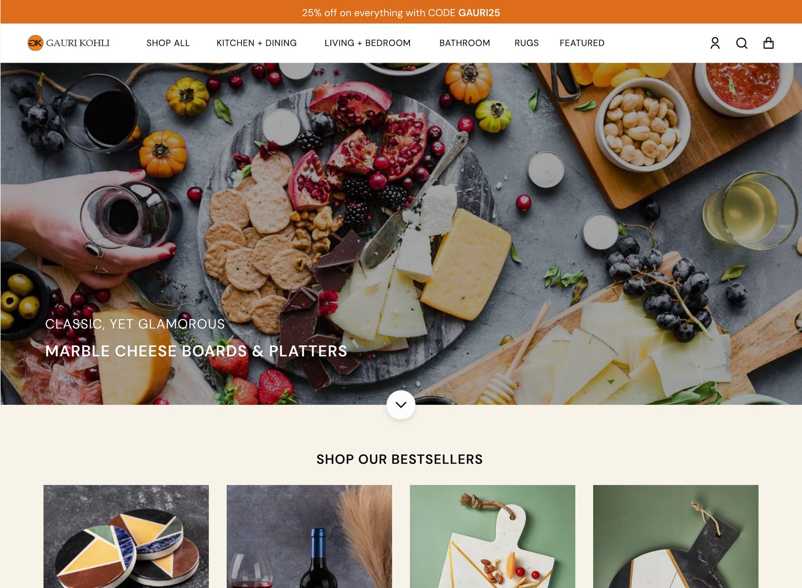
- ✕The homepage led with a discount banner — "25% off everything, code GAURI25" — on a brand whose product is hand-finished stone and brass. That's the opening line of a clearance sale, not a considered object.
- ✕Navigation was organised by room — Kitchen + Dining, Living + Bedroom, Bathroom, Rugs — which sorts inventory the way a hardware store does, not the way someone shopping for a wedding gift or a dinner party actually thinks.
- ✕Product pages showed a photo, a price, and little else — for objects where the whole pitch is material and craft, there was nowhere on the page making that case.
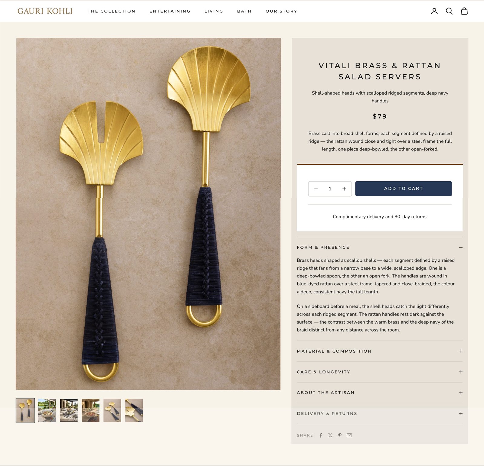
A product page should answer the questions you'd ask if you were holding the object in a shop — not just show a photo and a price tag.
Nobody shops for a "Living + Bedroom" item.
Room-based navigation is how a furniture warehouse organises stock — it assumes the shopper already knows which room they're furnishing. But most Gauri Kohli purchases aren't "I need a bathroom object," they're "I'm hosting people this weekend" or "I want something for the table." The old taxonomy forced a browsing mismatch: the customer's intent and the site's categories were speaking different languages.
I restructured the top-level navigation around how people actually shop for considered objects — occasion and material, not room.
"Featured / Last Call" — the old markdown-bin category — is gone from the top level entirely. "Our Story" is new: a place for material and brand narrative that didn't exist before, doing quiet work toward the trust a $300 onyx tray needs before someone buys it sight unseen.
If you can't touch it, the copy has to touch it for you.
The old product page was a photo, a title, a price, and a short description — standard Shopify defaults. For furniture-adjacent objects at this price point, that's not enough information to justify a purchase. Nobody hesitates over a $12 candle. People hesitate over a $79 pair of salad servers, and the hesitation is entirely reasonable: is this actually brass, or brass-plated? Will the rattan hold up? Who made this, and does that matter?
I rebuilt the product page as a structured accordion that answers those questions in the order they'd come up, rather than burying everything in one paragraph.
Form & Presence
What the object actually looks like in use — not spec language, description of how it reads in a room or on a table.
Material & Composition
Exact measurements, materials, colour, and surface texture — the concrete facts a photo can't fully convey.
Care & Longevity
How to keep it — proof the piece is meant to last, not a disposable decor purchase.
About the Artisan
Who made it and where — provenance as a trust signal, the same way a maker's mark works in person.
Delivery & Returns
Practical reassurance moved out of the fine print and into the page itself.
Every extra click is a chance to reconsider.
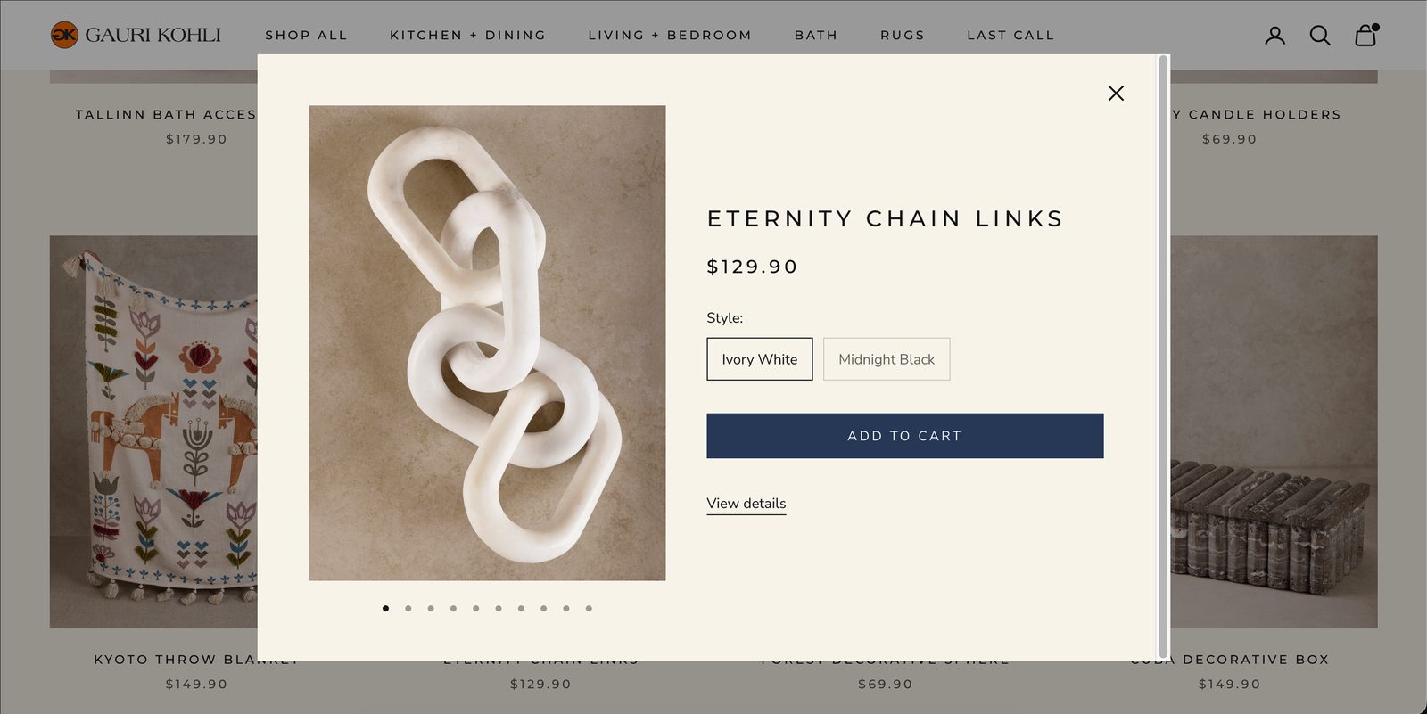
For a considered purchase, friction between "I like this" and "it's in my cart" is where hesitation turns into abandonment. Two patterns did the most work here: a quick-view popover that lets someone add to cart without leaving the browsing grid, and a cart drawer that keeps the running total and the rest of the store visible at the same time — nobody gets ejected onto a separate cart page and loses their place.
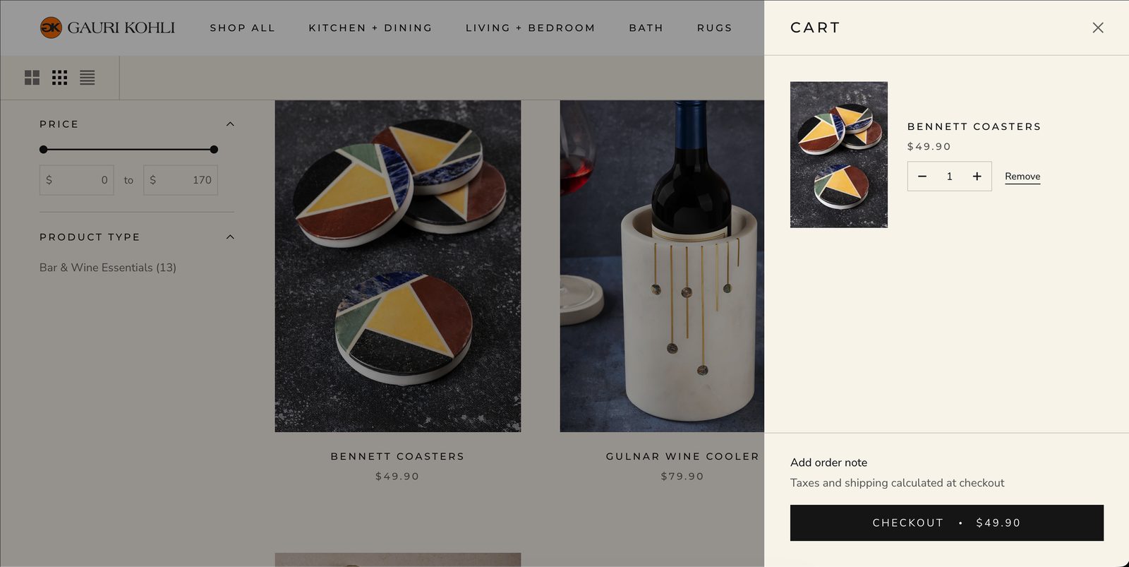
The product listing page also carries price-range and product-type filtering with a density toggle, so someone gift-shopping under a budget can narrow the grid in seconds rather than paging through the full catalogue.
Still live, word for word, years later.
The clearest evidence I can offer for this case study isn't a metric — it's that I can point at the current, live site and show the exact structure I designed still in production. I pulled the current listing for the same product shown in the PDP mockup above: the Vitali Brass & Rattan Salad Servers, still $79, still carrying the identical five-section structure and — in places — the identical sentence.
One more signal, offered carefully: the product's current customer reviews cluster around a small set of words —
"You can tell these are handcrafted. The woven detail on the handles and the gold finish feel thoughtfully done."
"The matte gold finish paired with the woven handles makes these feel really special."
Honest about the numbers I don't have.
Gauri Kohli is a platform used by 500K+ customers — that's the brand's own established scale, not a figure I'm claiming credit for growing. I don't have access to before/after conversion or return-rate data from this engagement, so I won't manufacture a number to make this section land harder. What I can stand behind is what's verifiably still shipping: the navigation structure, the PDP system, and a brand voice that's since matured even further in the direction this redesign pointed.
What I'd do differently
- →Instrument the PDP change properly. The material-storytelling rewrite is a testable hypothesis — does it reduce returns from "not what I expected" complaints? I'd want return-reason data tagged before and after to check.
- →Test the navigation rename directly. "Entertaining" versus "Kitchen + Dining" is a bet about how shoppers think, not a certainty. A tree test with real customers would confirm it rather than relying on my own reasoning.
- →Push the quick-view interaction further. It removes a page load, but I'd want session recordings to see whether people actually use it or default to the full PDP anyway.
What I'd keep
The core read — that a product page for a $79–$350 hand-finished object needs to do the reassuring work a shop clerk would do in person — is the part I'm most confident in, and the part that's visibly still guiding the brand's product pages years on.