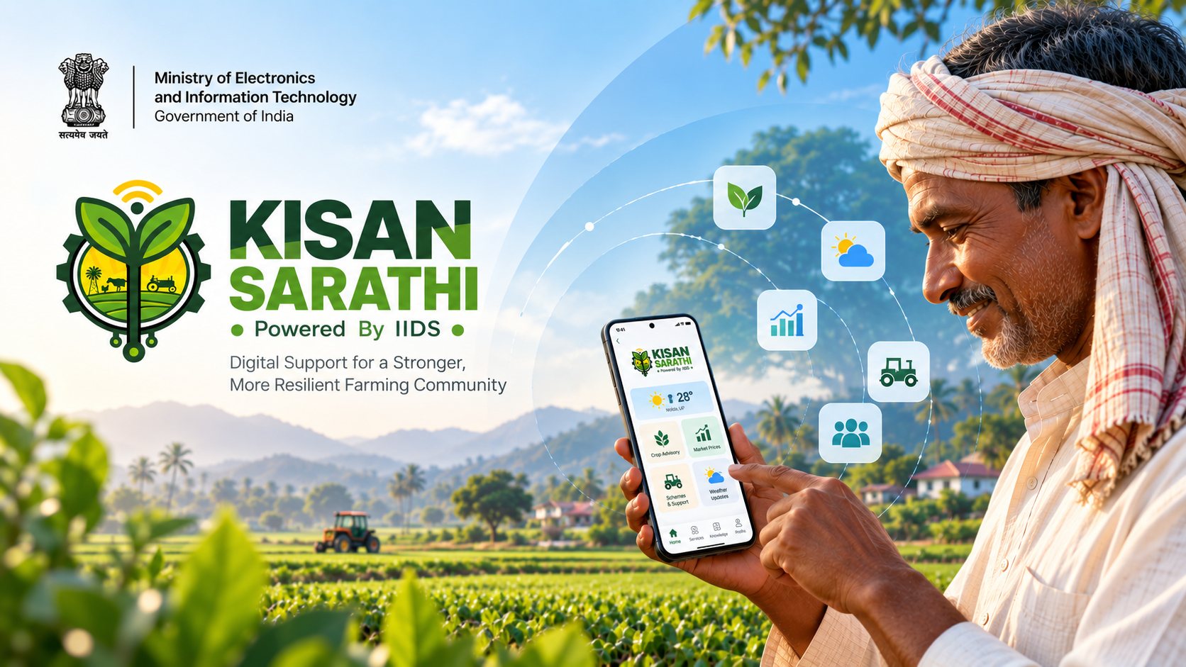
A national platform, and an app that has to earn a phone.
Kisan Sarathi launched in July 2021 as a joint initiative of the Ministry of Electronics & IT and the Ministry of Agriculture & Farmers Welfare. ICAR-IASRI and Digital India Corporation implement it. Farmers reach it through Kisan Call Centres, Common Service Centres, a web portal, WhatsApp and a mobile app. Behind every channel sit more than 730 KVKs, over 100 ICAR institutes and over 65 agricultural universities. By the government's June 2026 figures it serves 2.95 crore registered farmers across 768 districts, in 13 regional languages.
The brief was the farmer-facing mobile app for that network. The client stated its one job outright: the primary action is asking a question, and the person answering it is an ICAR scientist, not a search result. Everything else in the app has to earn its place by helping with that.
Every Indian farmer, in their language, on whatever phone they have.
"The user" here is closer to a country than a persona. The app has to cover four sectors (agriculture, horticulture, animal husbandry and fisheries), each with its own commodities and problems. It has to work for someone opening a government app for the first time, in whichever of the supported languages they read, and sometimes on a phone that belongs to someone else in the household.
On the other side of every conversation is a KVK expert, and the app serves both. A problem the farmer describes well is one the expert can solve quickly. A consultation the farmer can join without help is one the expert doesn't lose ten minutes to. Designing for the farmer meant designing the farmer's half of a conversation with a scientist.
Designing for an audience this large and this varied, while balancing feedback from eight or more contributors, each with a legitimate view of what the app is for.
Tested every Friday by the people who'd answer the questions.
With eight or more contributors, the risk was never too little feedback. It was feedback that pulled the app in different directions. The rhythm we settled into gave each kind of input its own place:
Friday sessions with KVK experts from across India
Every Friday, KVK experts nationwide downloaded the pre-release build. We gave them an orientation and walked them through each new feature, and they reported back on what they saw. It was field testing through the people closest to farmers.
Design review rounds
Around two review rounds a week with the PM, the client and stakeholders, where individual flows were critiqued and revised.
One major review with the client to check progress
Once a month, a larger review with the client took stock of the whole app: what had moved forward, what was waiting, and what belonged in the MVP.
Fewer steps, plainer names, and blue, not green.
The non-AI version came first, and most of the design changes came out of its reviews. Four stand out:
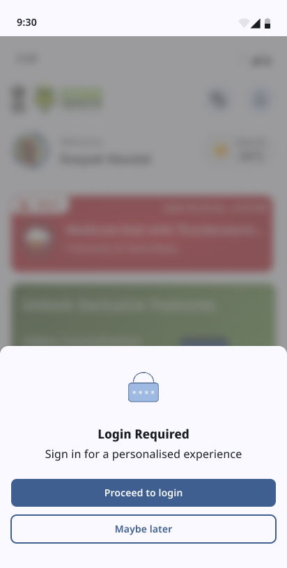

Why I argued for blue
Search the Play Store for a farming app and you get a field of green: green icons, green leaves, green headers, one after another. Green is the natural colour for agriculture, and that's why I pushed back on it. In green, Kisan Sarathi would have blended into the shelf. It would have been one more leaf in a row of leaves, and a farmer scrolling on a small screen would have had no reason to stop on it or to remember it afterwards.
Blue does two things green couldn't. It stands out on that shelf, and it reads as a public service rather than another agri-commerce app. That fits what Kisan Sarathi really is: a direct line to a government scientist. It also backed up the stakeholders' own note that the colour scheme shouldn't "shout anything farming related". The farming belongs in the content (the crops, the photos, the advice), not painted over the interface.
The shipped palette
- #3F5F90 Active states, CTAs, app theme
- #EEF4FF Home screen banner
- #F9F9FF Bluish-white background
- #191C20 Text
The same reviews also decided what not to build yet. A number of proposed features were moved to phase 2 on priority, because the MVP had to reach the public first. An app that ships the core promise beats one that ships everything late.
From "I have a problem" to "an expert has it", in three screens.
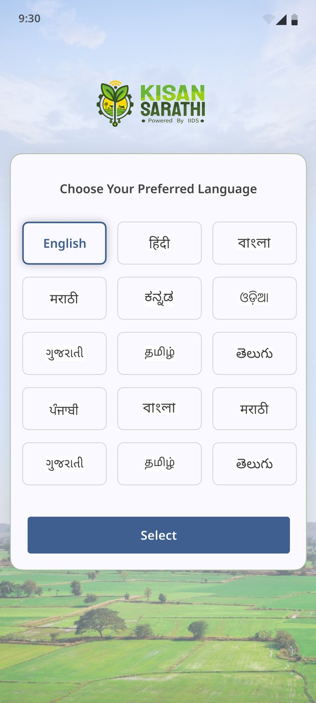
Getting in
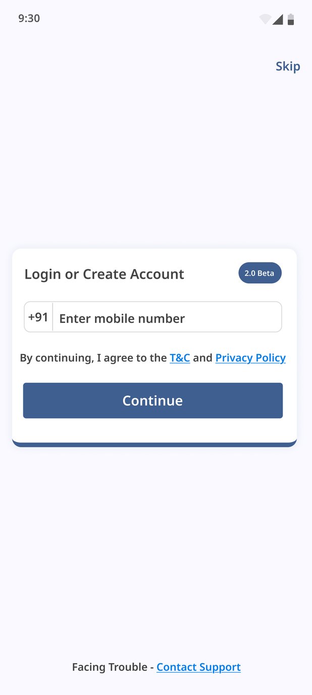
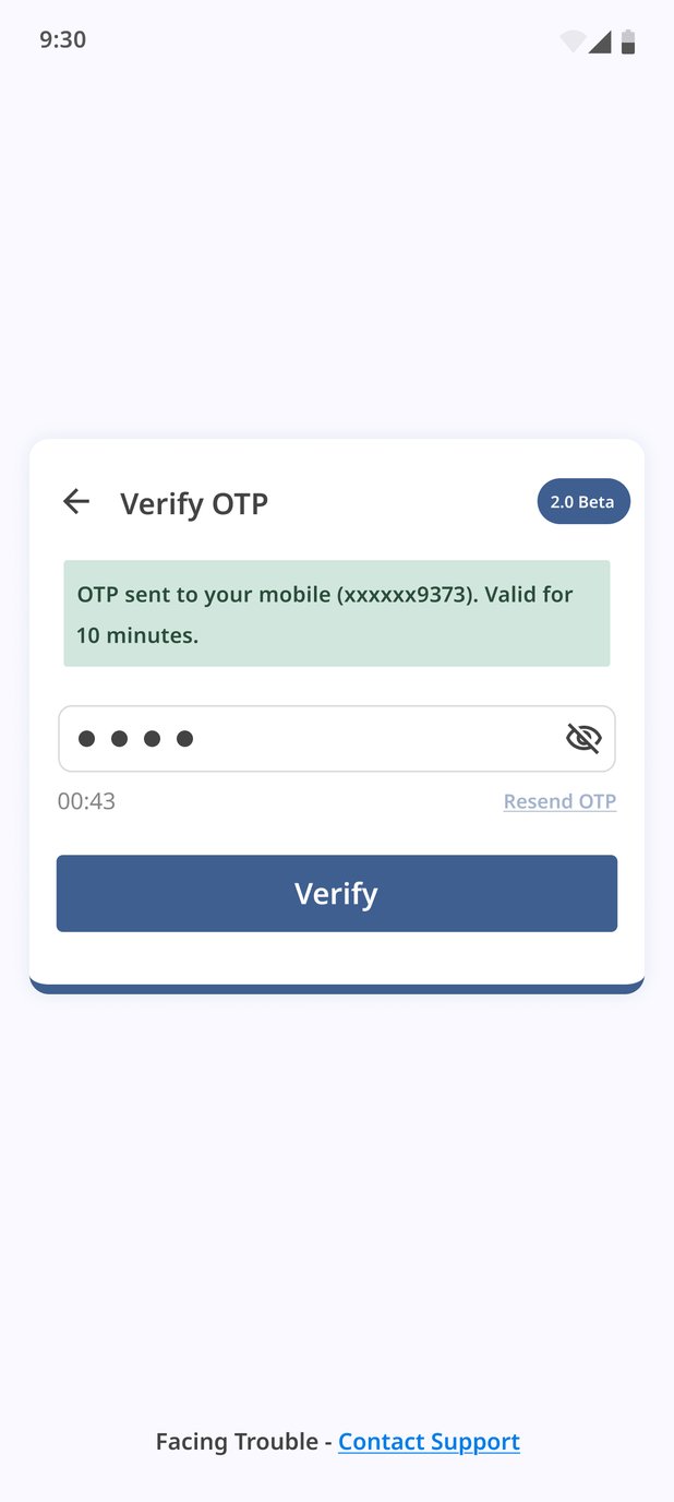
The first question is language, before anything else. The app doesn't ask for a phone number until it knows which script to ask in. Login is a single mobile-number field with the consent line inline ("By continuing, I agree to the T&C and Privacy Policy"), a Skip for guests, and "Facing Trouble? Contact Support" at the foot of both steps. The OTP screen shows the masked number it was sent to, says it stays valid for 10 minutes, and counts down before Resend unlocks.
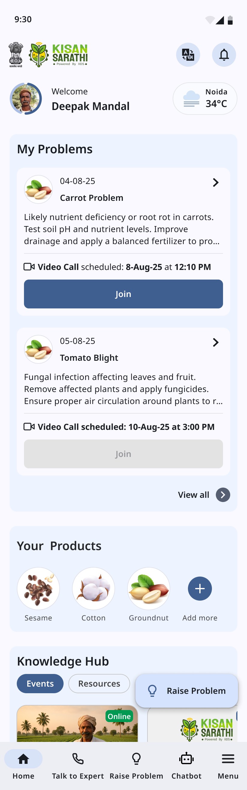
Three home screens, not one
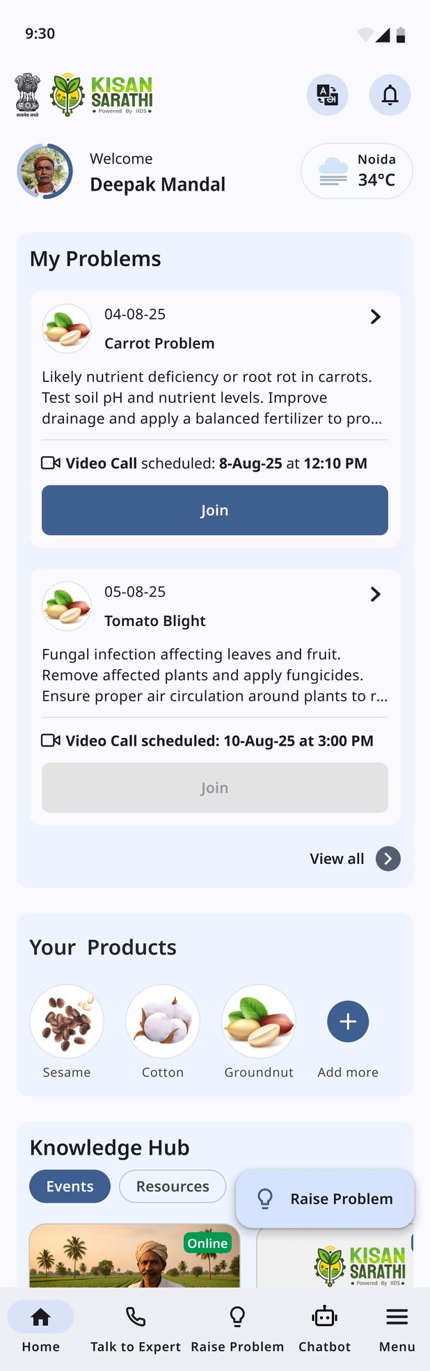
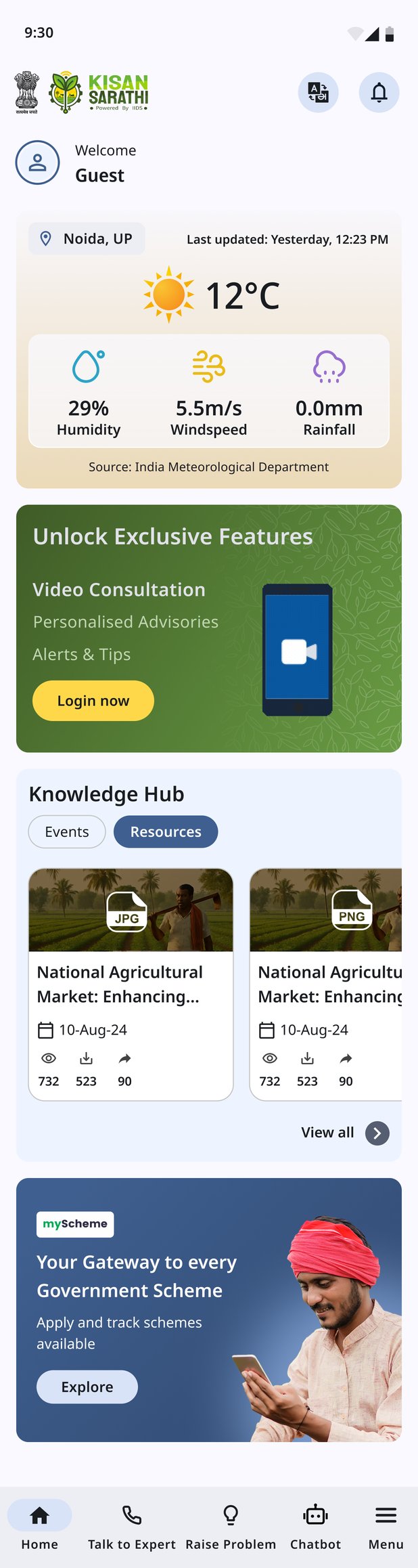
The home screen is designed for three different people. A logged-in farmer with open problems sees them first, with a Join button that becomes active when the video call is due. A guest gets weather from the India Meteorological Department, the Knowledge Hub and schemes, plus a card that lists what logging in unlocks (video consultation, personalised advisories, alerts and tips). It's an invitation, not a wall. A logged-in farmer with no problems yet sees a "Your Farm Solutions just a click away!" banner that leads straight into Raise Problem. None of them is just the logged-in screen with gaps.
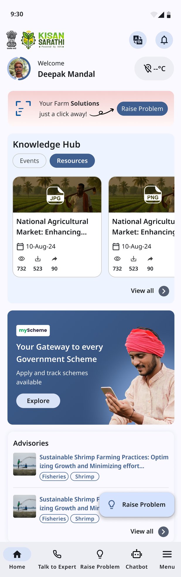
Scroll inside a phone to see the full screen
The query itself
Raise Problem is three steps, and the stepper at the top says so on every screen: Product → Problem → Preview. A farmer always knows how much is left.
- 01 Product Search, speak, or pick from My products and the sector chips Tap a cropVoice input
- 02 Problem Describe it in your own language and attach the evidence CameraVideoGalleryRecord
- 03 Preview Check everything before it goes SubmitBook video appointment
- 04 Submitted The experts have the problem and will share advice soon Expert has it
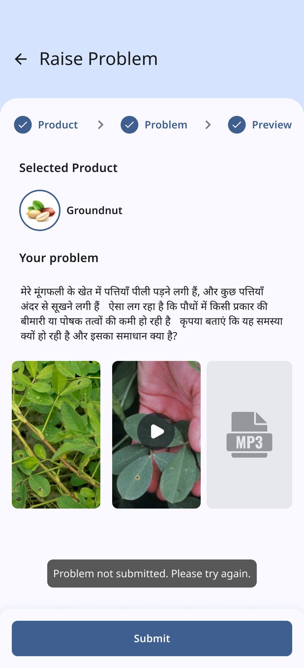
- 1st try Toast: "Problem not submitted. Please try again." Everything entered stays on screen.
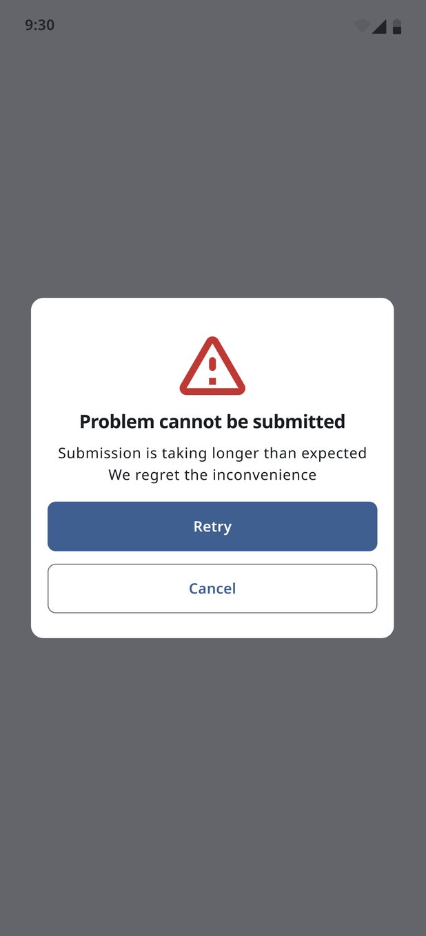
- 2nd try Pop-up: "Problem cannot be submitted". It explains why and offers Retry or Cancel.
- Never Losing the farmer's description to a timeout.
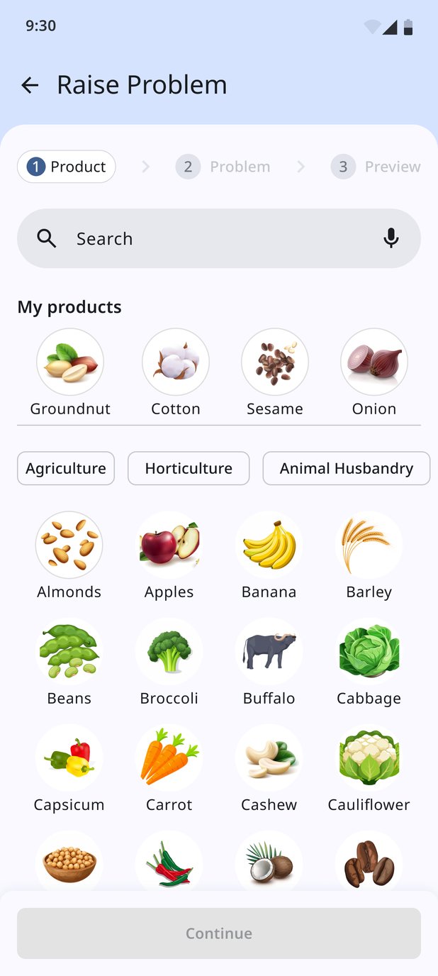
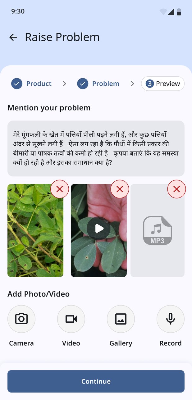
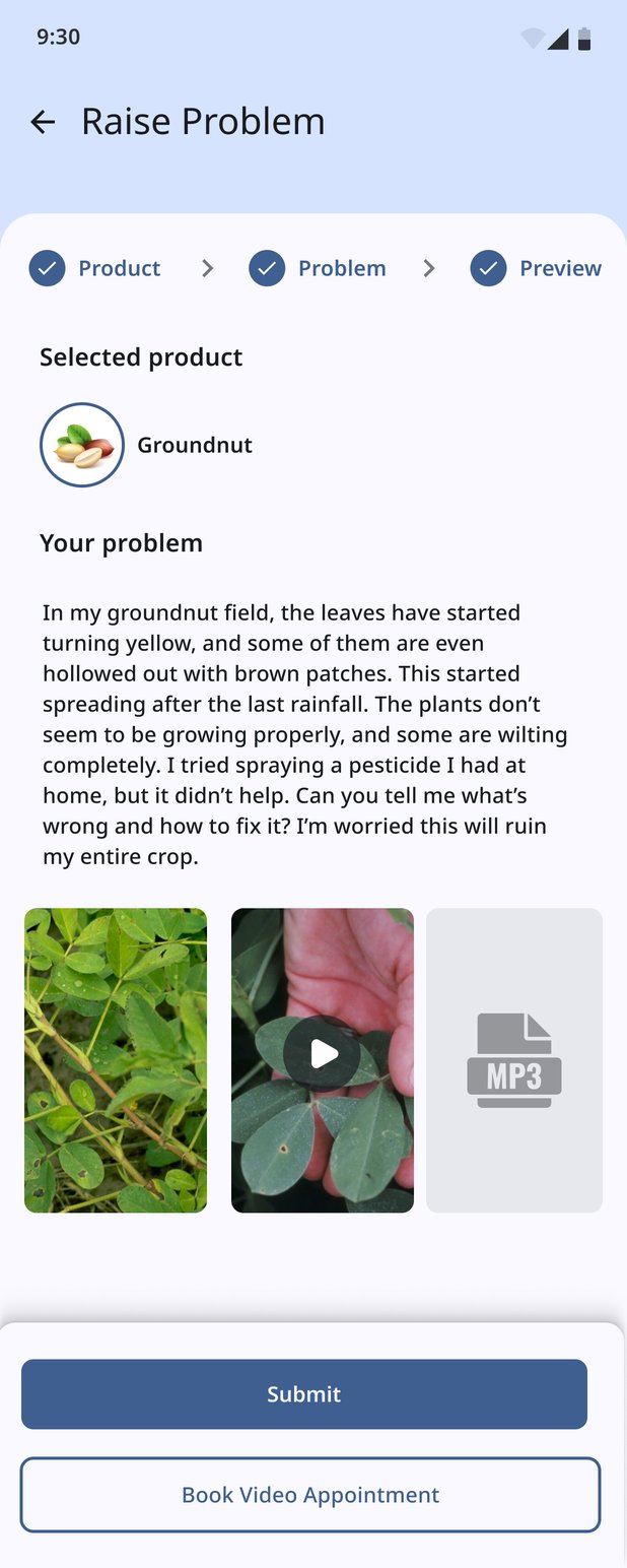
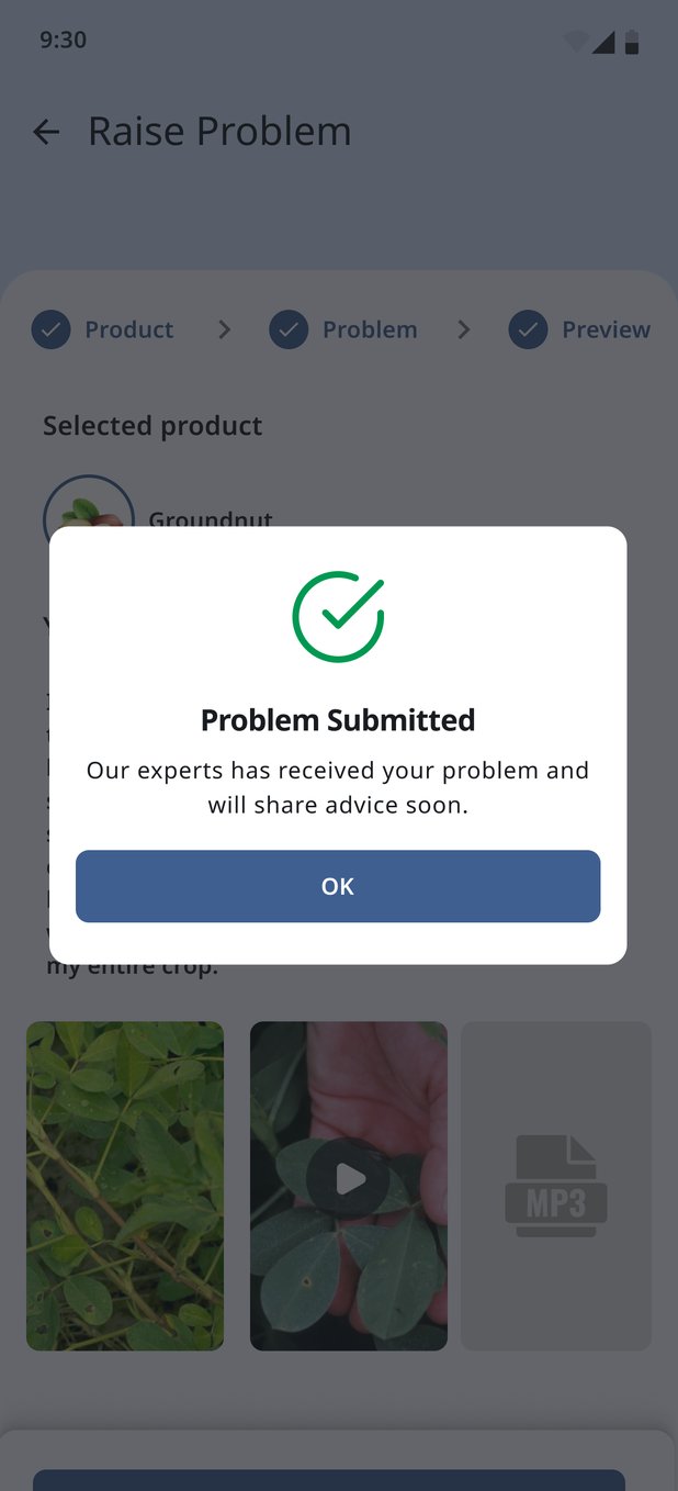
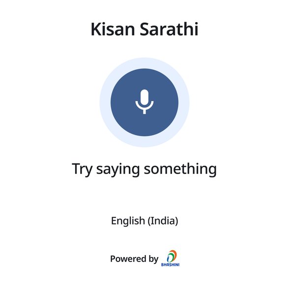
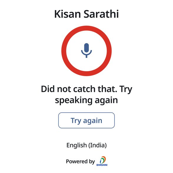
Choosing the product can be done by voice, for the farmer who can't easily type a crop name. The speech prompt is short ("Try saying something", in English (India)), and so is the failure: "Did not catch that. Try speaking again", with one button to do exactly that. The description can be written in the farmer's own language; the example here is in Hindi. Photos, video and audio sit side by side, each removable before sending. Preview also offers a way out of writing: book a video appointment instead.
When it doesn't go through
Rural connections drop, so failure is designed in two stages. The first failure is a toast that leaves everything on screen, so the farmer just taps Submit again. If that fails too, a pop-up takes responsibility instead of blaming the network ("Submission is taking longer than expected. We regret the inconvenience") and offers Retry or Cancel. A farmer who spent five minutes describing a sick crop should never have to type it again.
Choosing a scientist should feel like choosing a doctor, not a queue.
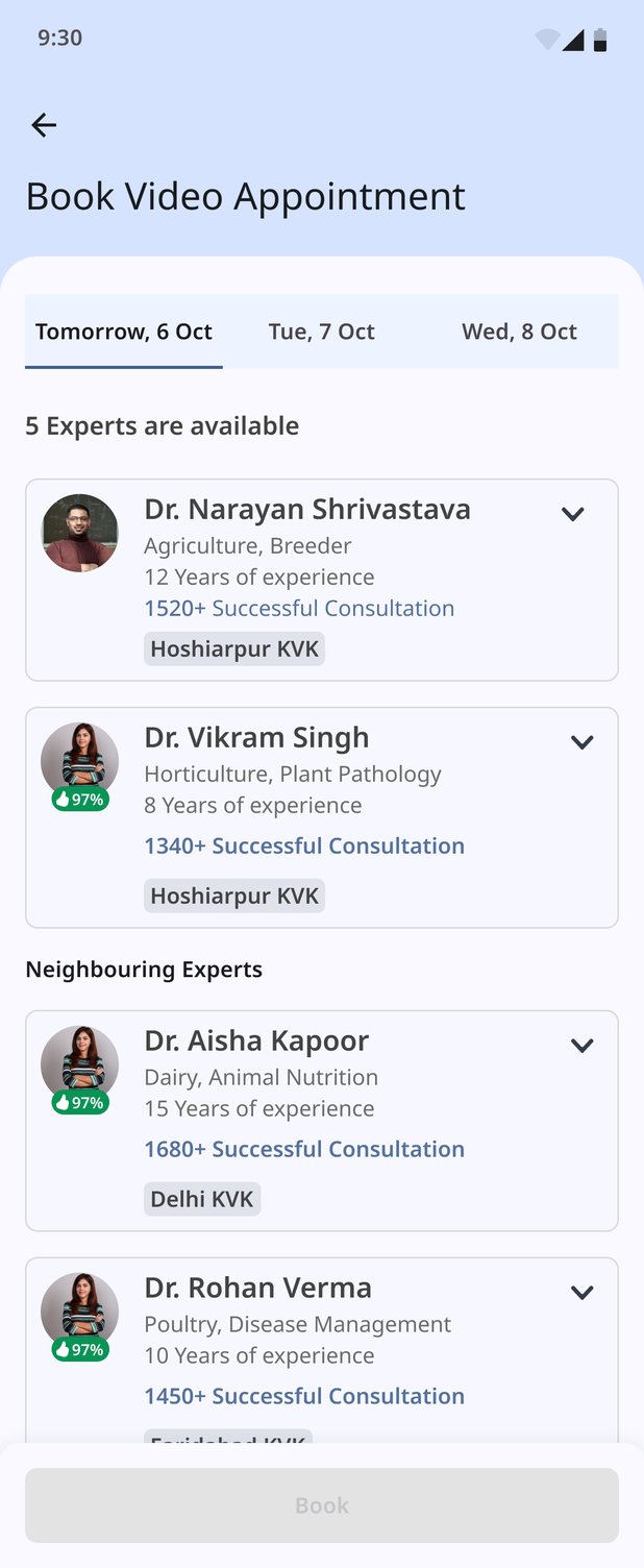
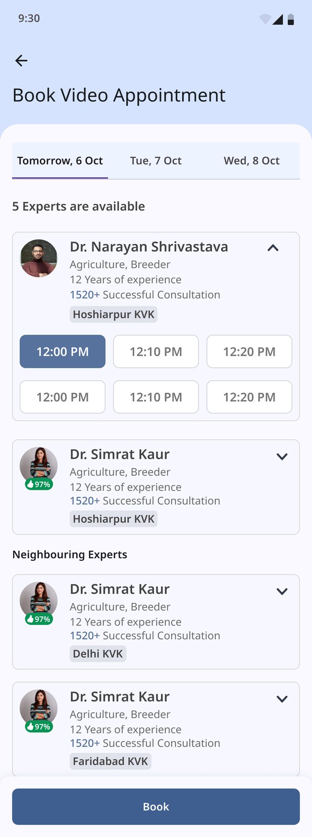
Some problems need a conversation, not a written reply. Booking a video consultation starts with a day (Tomorrow, then the next two dates) and a plain count: "5 Experts are available". The farmer's own KVK comes first, then a separate group of neighbouring experts, so a busy local KVK doesn't mean no help.
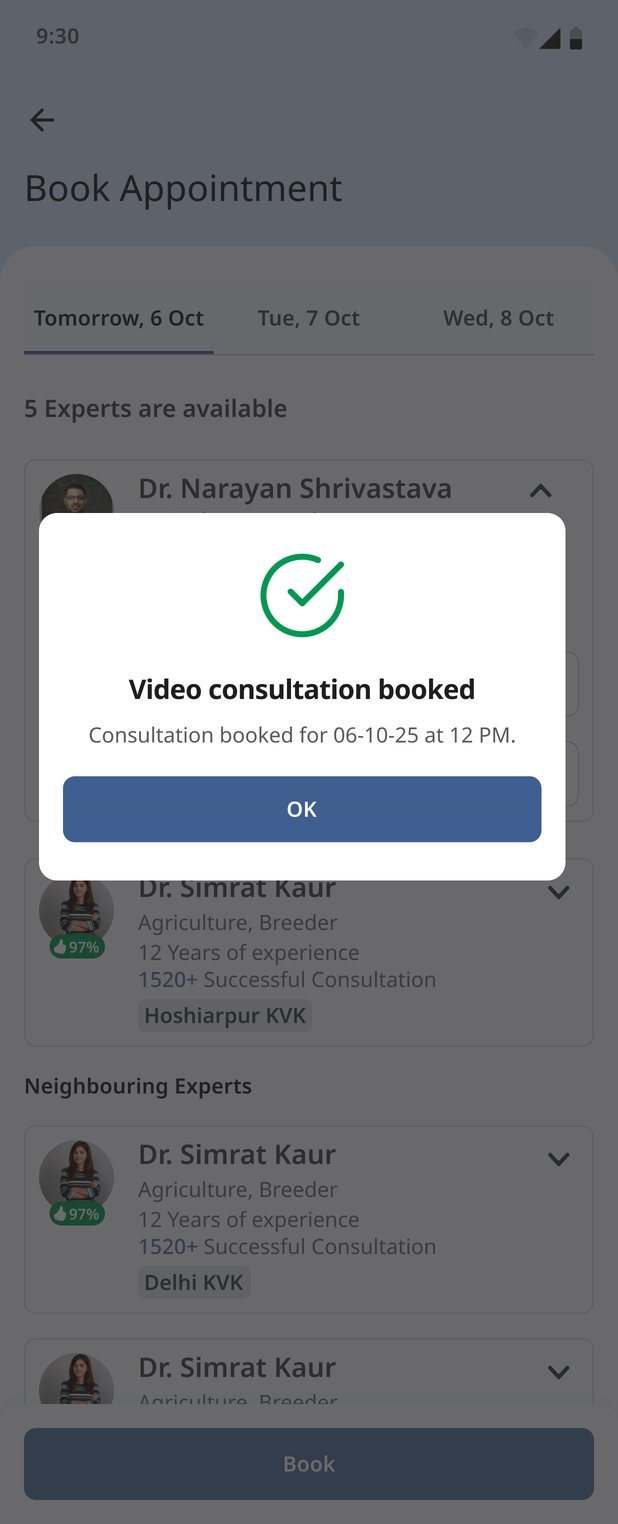
Each expert card carries what a farmer needs to trust a stranger with their crop: domain and specialisation, years of experience, how many consultations they've done, their KVK, and an approval rating. Tapping a card opens its time slots in place, with no new screen to get lost in. Book stays disabled until a slot is chosen, and the confirmation repeats exactly what was booked: "Consultation booked for 06-10-25 at 12 PM."
The call lives where the problem lives
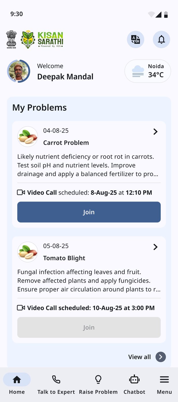
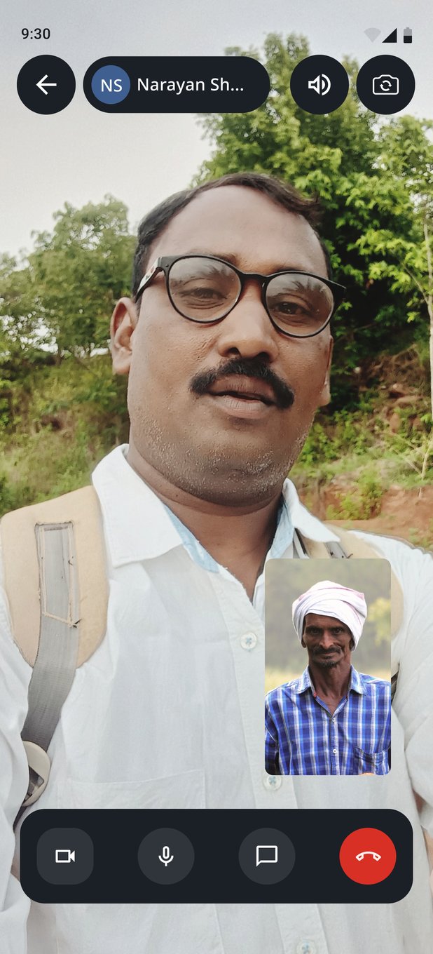
A booked call doesn't move to a separate calendar. It appears on the problem's own card on the home screen ("Video Call scheduled: 8-Aug-25 at 12:10 PM"), and the Join button turns active only when that call is due. A later call sits on the next card, its Join still greyed out. The call screen itself is deliberately sparse: the expert full-screen, the farmer in a corner, and four large controls for camera, microphone, chat and hanging up.
After the call, something to keep
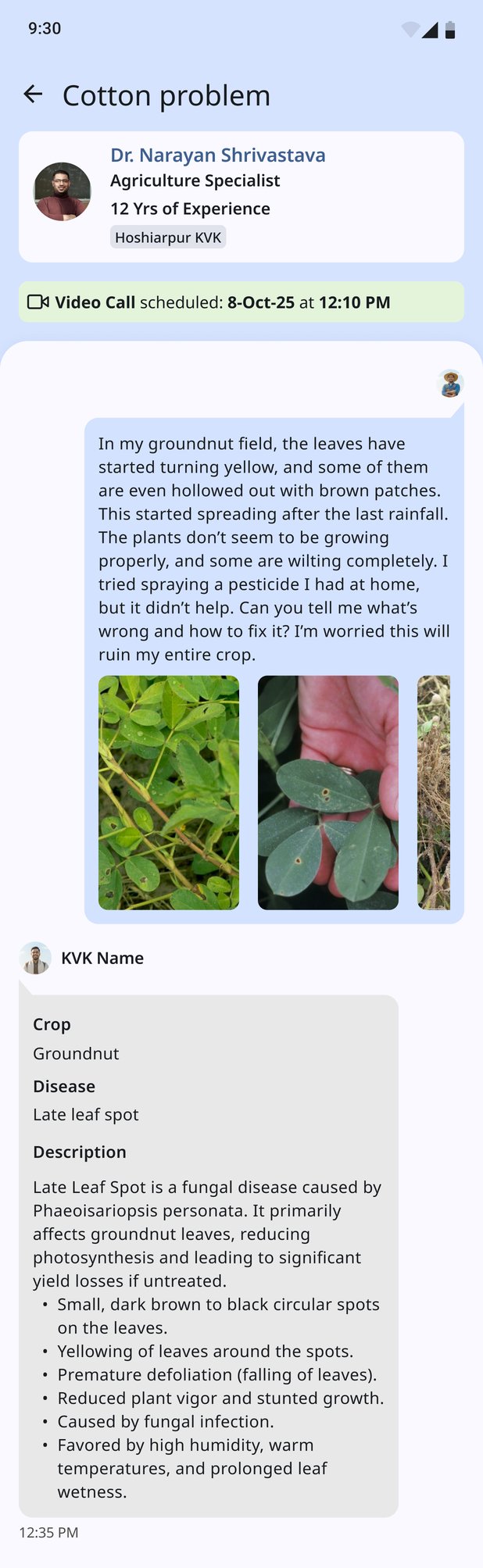
The problem detail reads as one thread. The farmer's own words and photos come first, then the KVK's reply in a fixed structure: Crop, Disease, Description, with the symptoms as a scannable list. A Download Prescription button sits under the reply, because advice you can't show at the input shop is advice half-followed.
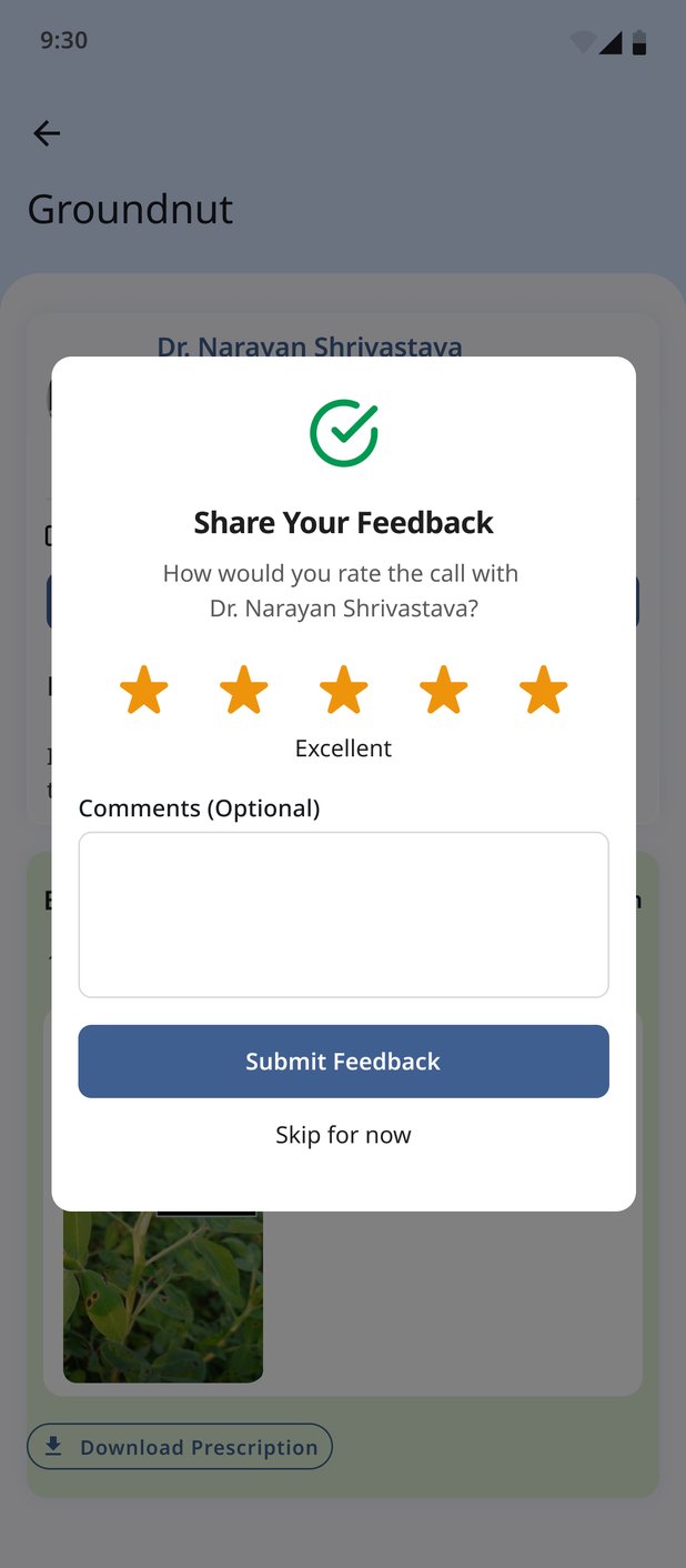
Then the app asks how the call went: five stars with a word for the rating ("Excellent"), optional comments, and a plain Skip for now. Feedback that blocks the farmer from leaving isn't feedback worth having.
One expert, one farmer, or one question to the whole country.
Queries and consultations are one-to-one. The rest of 2.0 Beta lets one KVK, one institute, or ICAR itself reach many farmers at once, through events, advisories and a national poll.
Events and webinars, for one-to-many
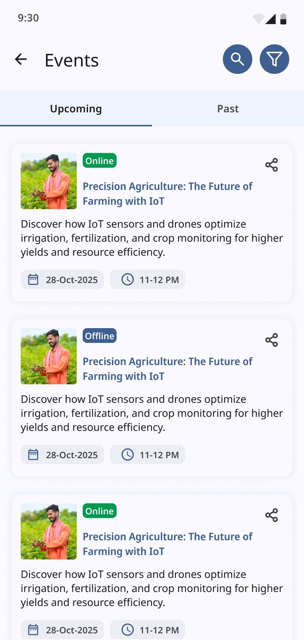
Video conferencing started as an explicit "future scope" item in the stakeholder brief, and it shipped in 2.0 Beta. Events are split into Upcoming and Past, and each card answers the first question a farmer has, before the title: Online or Offline, meaning can I join from my phone, or do I have to travel? Date and time sit on every card, with search, filters and a share button for forwarding to a neighbour.
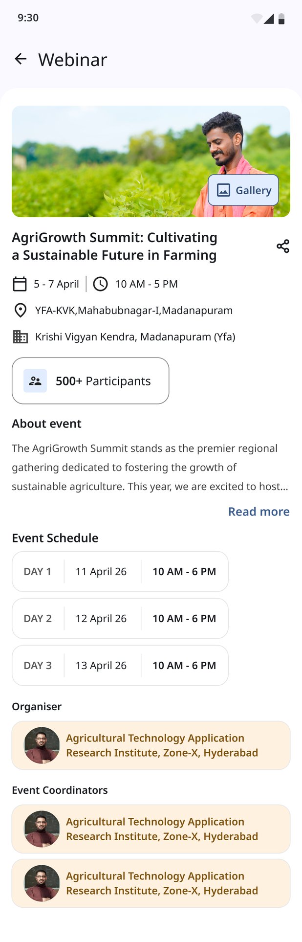
An event's detail page reads like a notice board: where and when, how many people are coming ("500+ Participants"), a day-by-day schedule for multi-day events, the organising institute and coordinators, and a gallery for what happened.
Advisories, in more than text
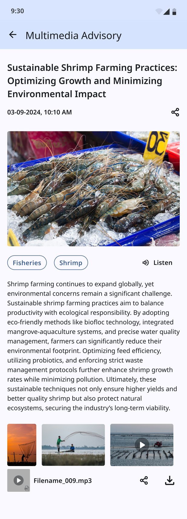
Advisories that experts publish are tagged by domain and commodity (here, Fisheries · Shrimp), so they reach the people who grow that crop or raise that stock. Every advisory has a Listen button at the top, so a farmer who'd rather hear it than read it can. Photos, videos and an audio file sit under the text, and the audio can be shared or downloaded for when there's no signal.
The poll, for the country talking back
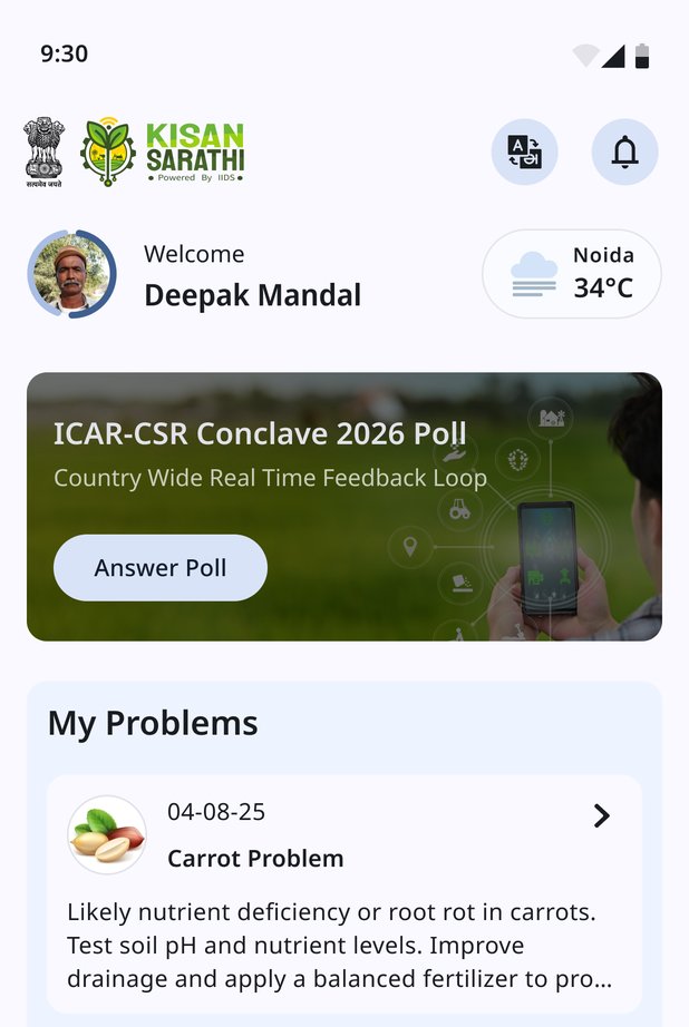
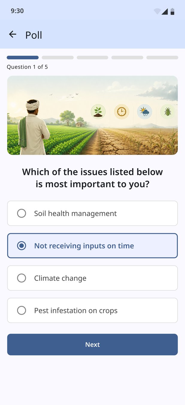
The ICAR-CSR Conclave 2026 ran a country-wide, real-time feedback loop through the app. The poll doesn't hide in a menu. It takes the top of the home screen as a banner with one action, Answer Poll. Inside, it asks one question per screen, with a segmented progress bar and "Question 1 of 5", so the farmer always knows how long it will take. The first question asks what matters most: soil health, inputs not arriving on time, climate change, or pests.
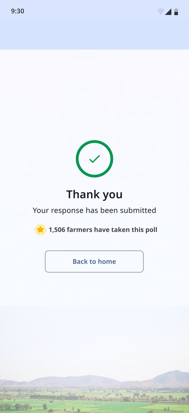
The thank-you screen shows how many farmers have already taken part, so each answer feels like part of something national, not a form sent into the void. Then it offers one way out: Back to home.
I designed the AI version. The client was right to say no.
Digital India Corporation suggested bringing AI into the app, and the AI-assisted version was my answer to that. I proposed it and designed it end to end, in its own file, alongside the non-AI app.
What it did
It kept the expert, but let the model go first. The onboarding made that order explicit: one screen promised "Get Expert Help Anytime", the next "Diagnose Crop Diseases Instantly". A mascot assistant spoke the AI's lines, so the model's voice always looked different from an expert's.
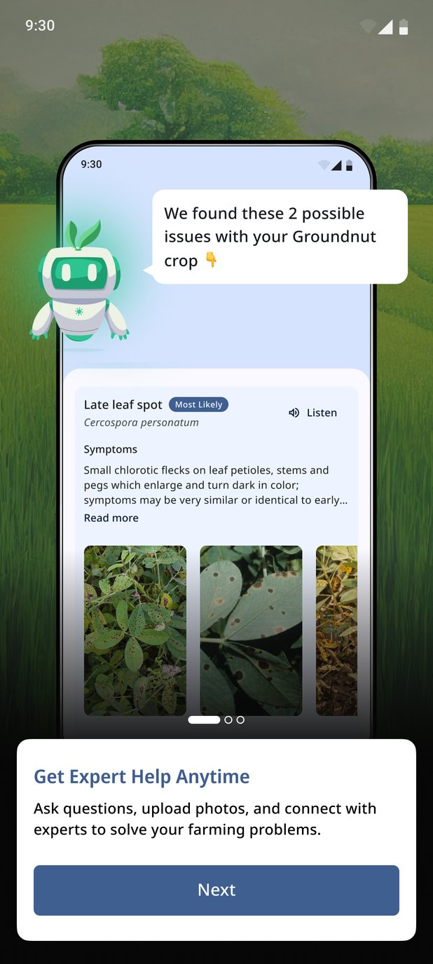
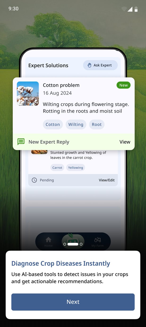
Photo diagnosis, hedged on purpose
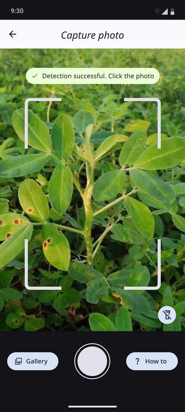
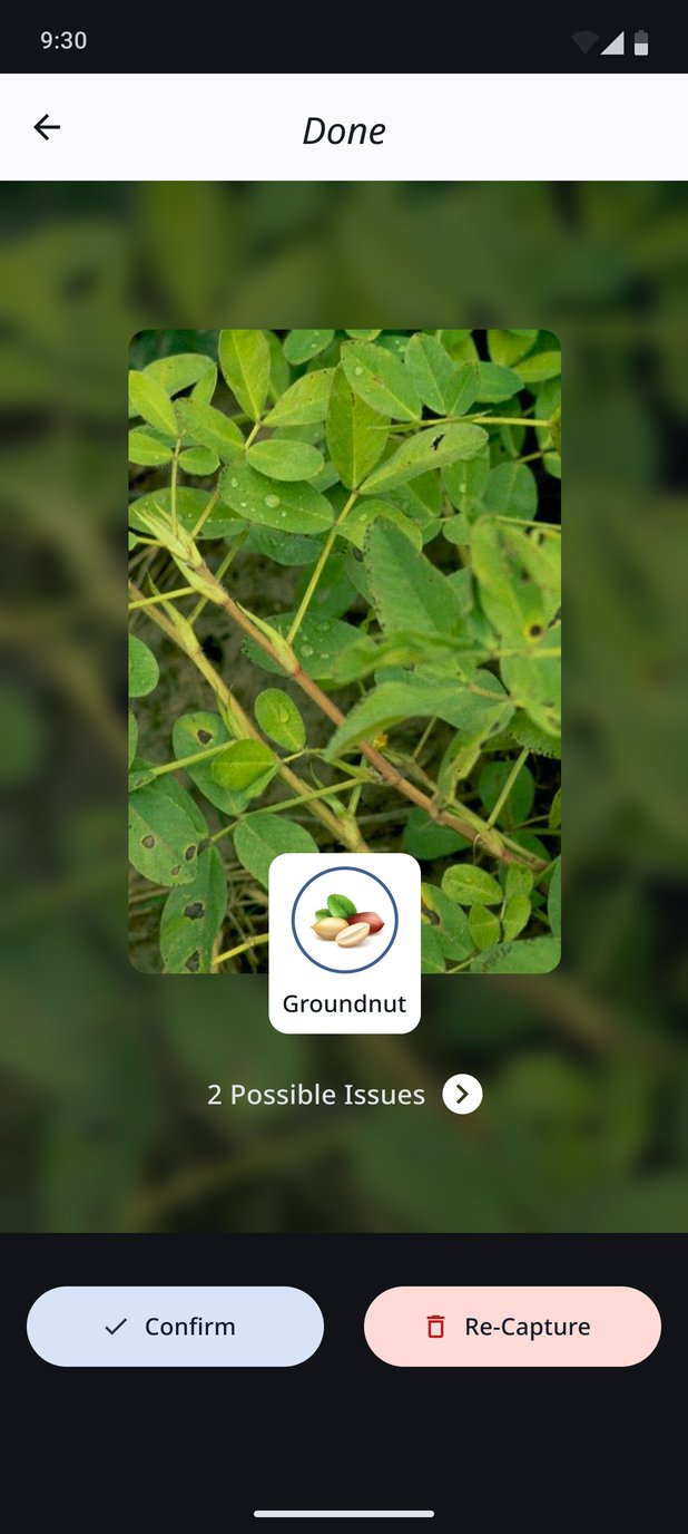
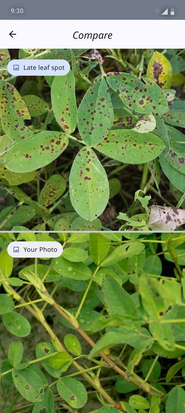
The camera coached the shot ("Detection successful. Click the photo"), with Gallery and a "How to" guide for farmers unsure what a usable photo looks like. The result was "2 Possible Issues", in the plural and never a verdict, with Confirm and Re-Capture side by side. The comparison screen put a reference photo of the suspected disease directly above the farmer's own photo, so the farmer could judge the match with their own eyes instead of taking the model's word for it.
Krishi Saathi, and the farm measured on foot
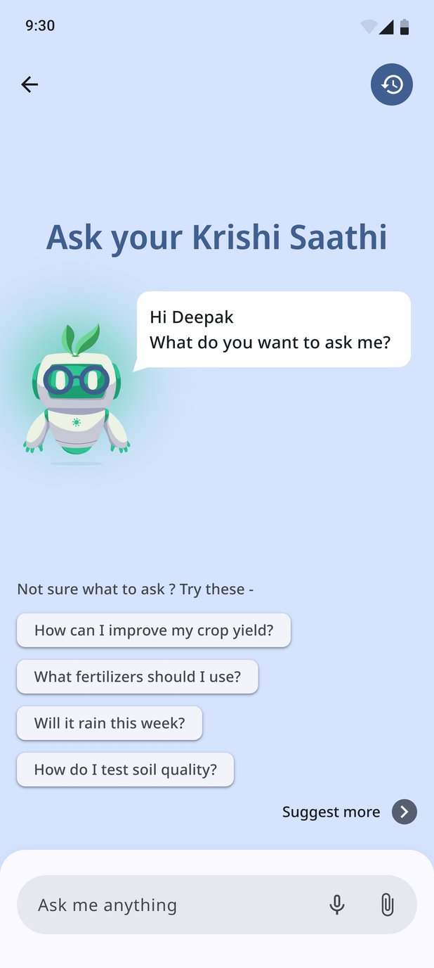
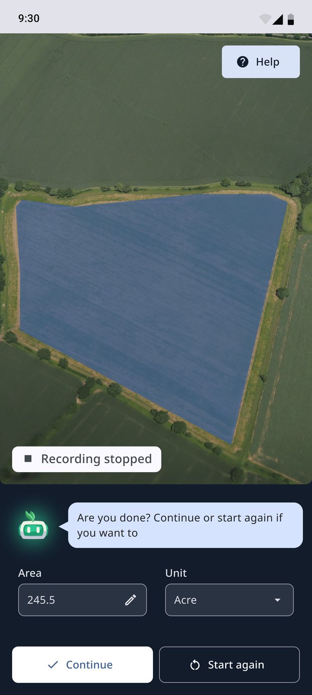
The conversational assistant, "Ask your Krishi Saathi", greeted the farmer by name and offered starter questions for anyone unsure how to phrase theirs, with voice and attachments in the input. Onboarding measured the farm by having the farmer walk its boundary, with the area worked out from the walk, editable, and a clear "Continue or start again" when they finished. It asked nobody to know their acreage off by heart.
An expert, one step behind the model
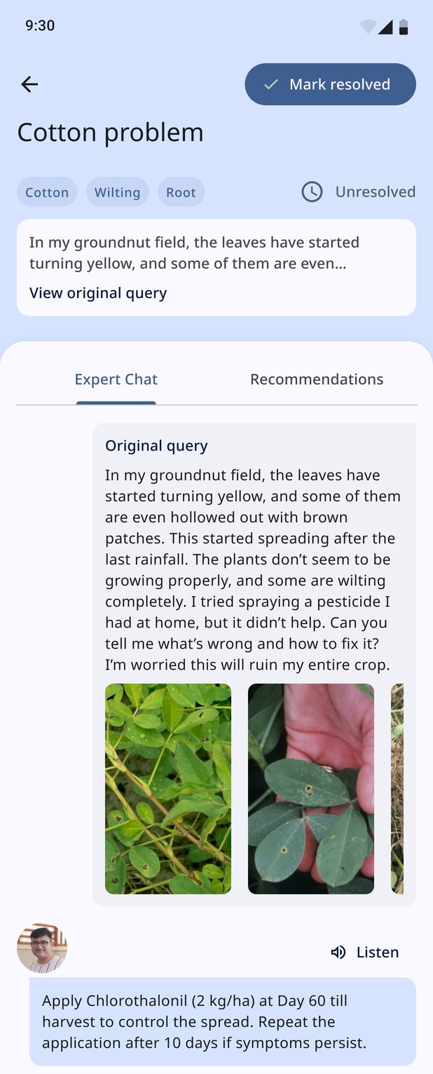
The AI never closed a problem. Each one stayed Unresolved until the farmer marked it resolved, and moved into an Expert Chat thread with the original query and photos attached, so the expert never had to ask twice. The expert's reply carried a Listen button, the same as advisories, and the farmer could keep talking by text or voice.
- Choose product
- Describe, attach
- KVK expert answers, in writing or on a call
- Choose product
- Photo
- Model suggests possible issues
- Farmer may act, or ask for an expert
- Expert replies in the thread
Where a person takes responsibility for the answer
Why it was rejected
One app, many languages, one promise.
Kisan Sarathi is live on Google Play, published by Digital India Corporation under MeitY. At the time of writing it has over 1 lakh downloads and a 4.2★ rating from 239 reviews. Version 2.0 Beta shipped with the five features that carry the promise: expert query and solution, one-to-one video consultations, video conferencing for webinars, multimedia advisories, and the national poll. Features that didn't serve the MVP were moved to phase 2 on purpose, not by accident.
Play Store figures as of September 2026
What I'd want next
- →Sessions with farmers, not only experts. The Friday KVK sessions were invaluable, but experts reviewing on farmers' behalf isn't the same as watching a farmer raise their first problem on their own phone, in their own field.
- →Time-to-answer as the headline metric. Everything in this app is judged by how quickly a real expert's answer reaches a real farmer. I'd want that number on the wall.
- →A written decision log. With eight or more contributors over two years, the reasons behind decisions like blue over green or phase 2 over MVP deserve to be written down when they're made, not remembered afterwards.
What I'd keep
The discipline of letting the purpose win the argument. When eight or more people have opinions, and even when my own AI idea was on the table, the question that settled it was always the same: does this get a farmer's problem to a real scientist faster? It's also the reason I'd make the same call the client did.